Personal Websites
WEBSITE DESIGNS + BUILDS
Distinctive websites that help writers, artists, and independent professionals stand out in a sea of overused templates. Each site is intentional and idea-driven, with thoughtful color palettes and typography systems, and visual elements that actually serve a purpose, delivering easy, sophisticated design. These sites give creative individuals an authentic online presence that truly feels like them.

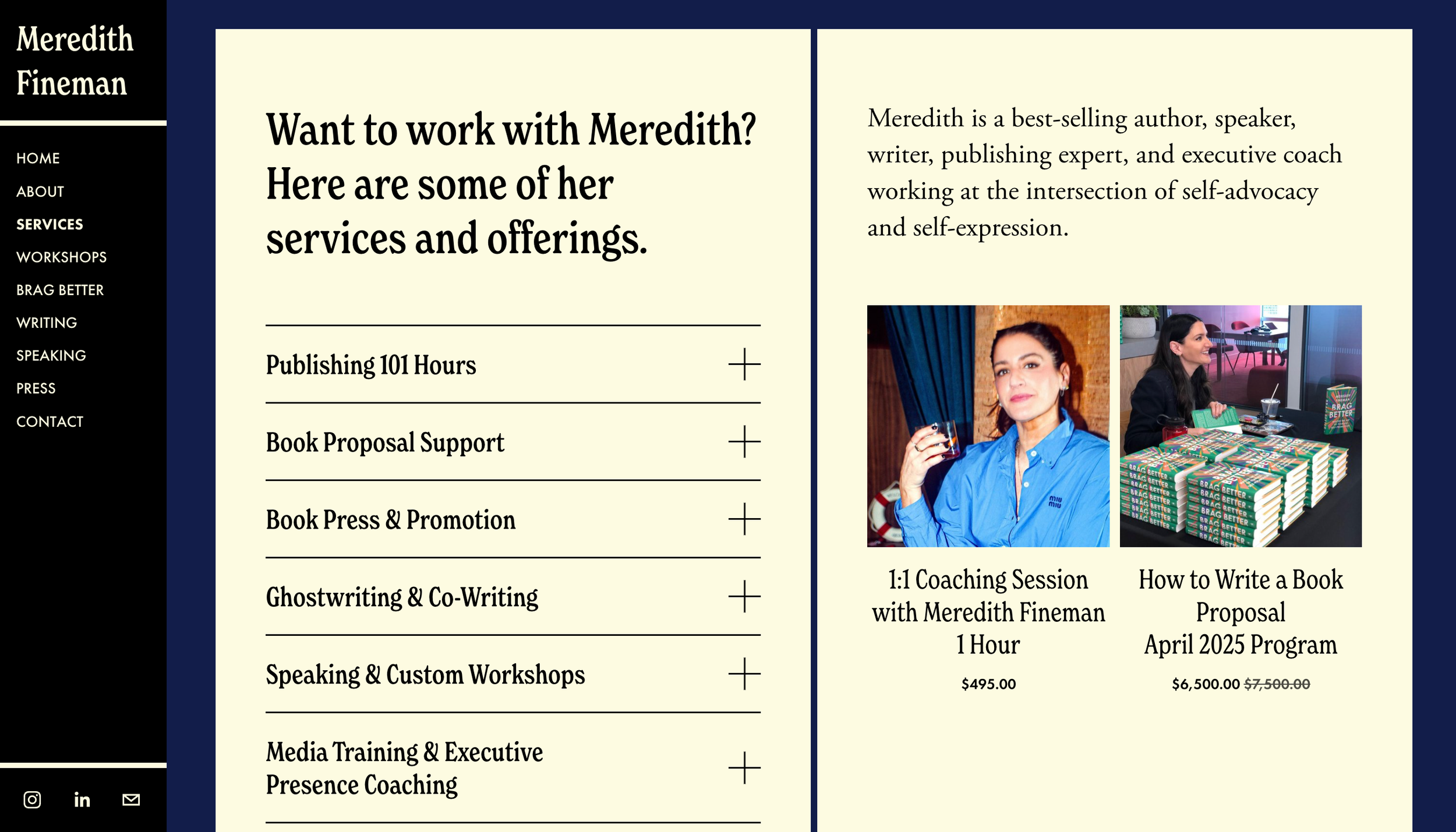
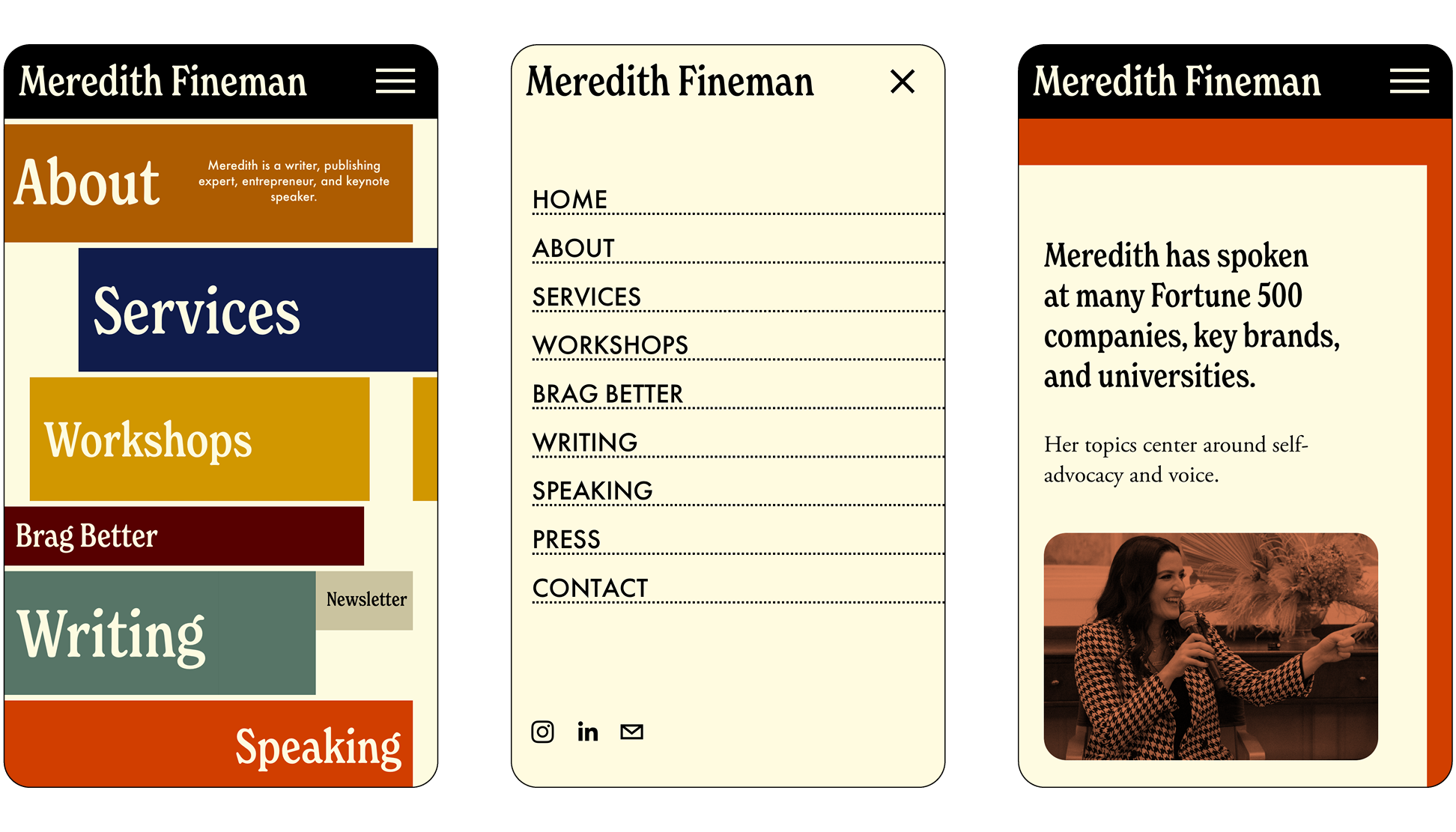
Meredith Fineman
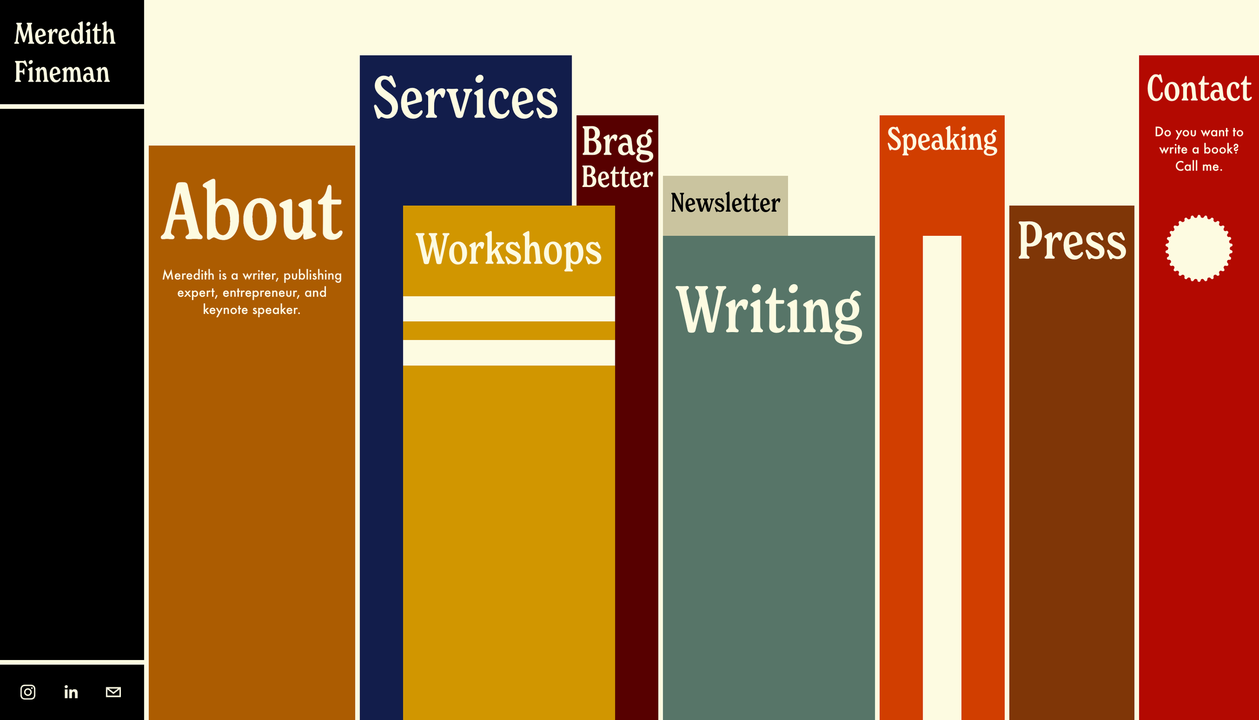
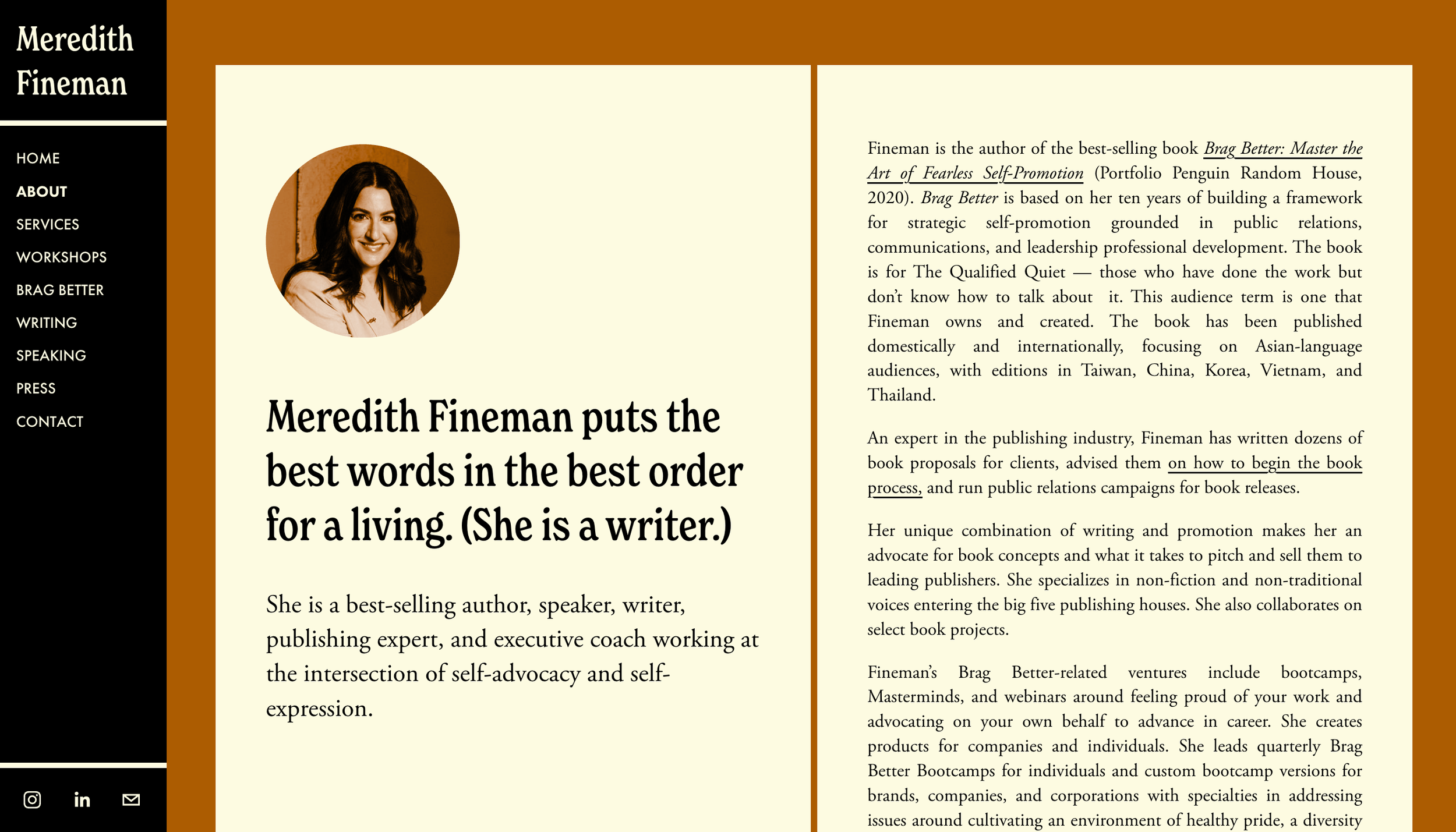
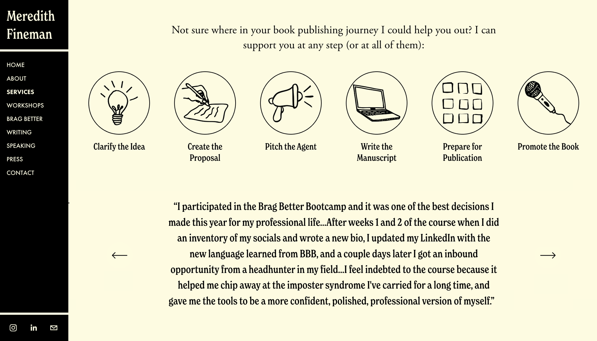
Meredith guides aspiring writers through the publishing landscape as a best-selling author, speaker, and coach. Her website translates her digital presence into a personal library—visitors browse a virtual bookshelf on the homepage, selecting volumes that open to reveal different sections of her work. A vertical book serves as the navigation, while dynamic typing animations for headlines reinforce her expertise. Hand-drawn illustrations appear throughout, echoing the intimate process of annotating a favorite book. The 70s-inspired color palette and typography reflect her vintage sensibilities, transforming a professional portfolio into an engaging metaphor for Meredith’s role in helping others find their place on the shelf.


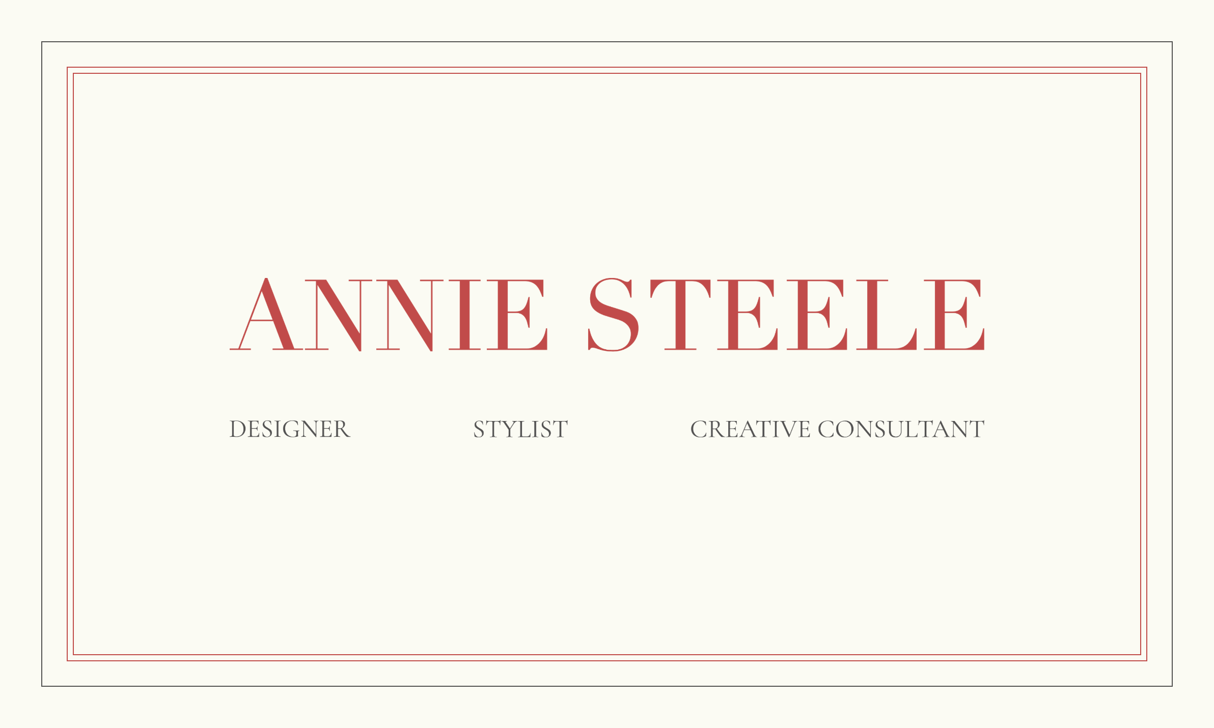
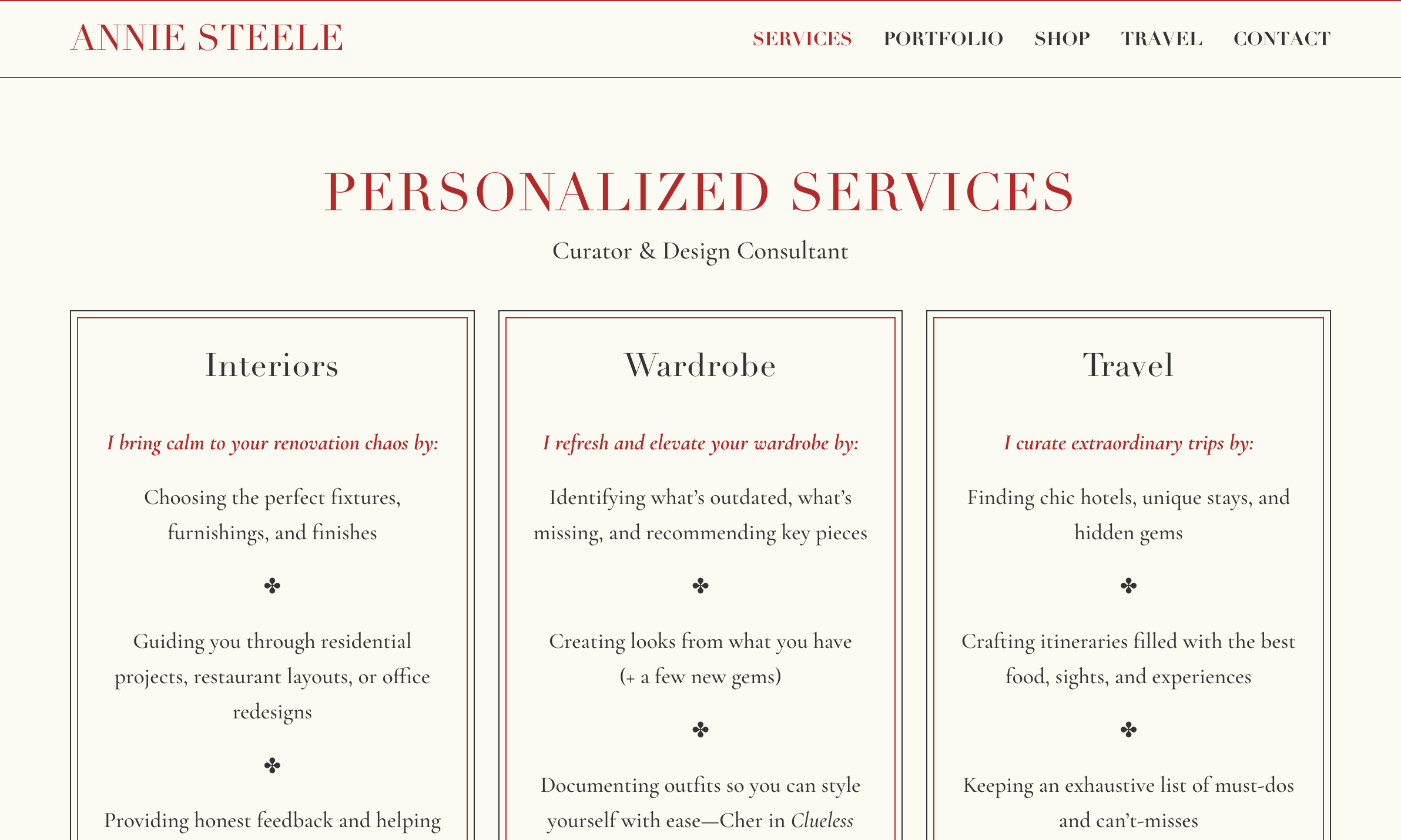
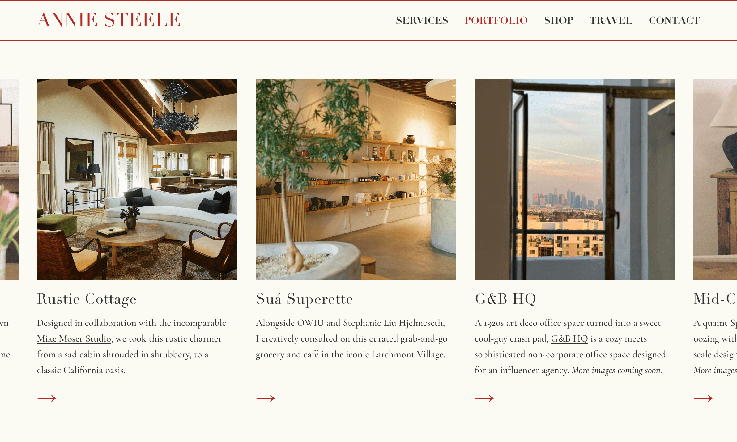
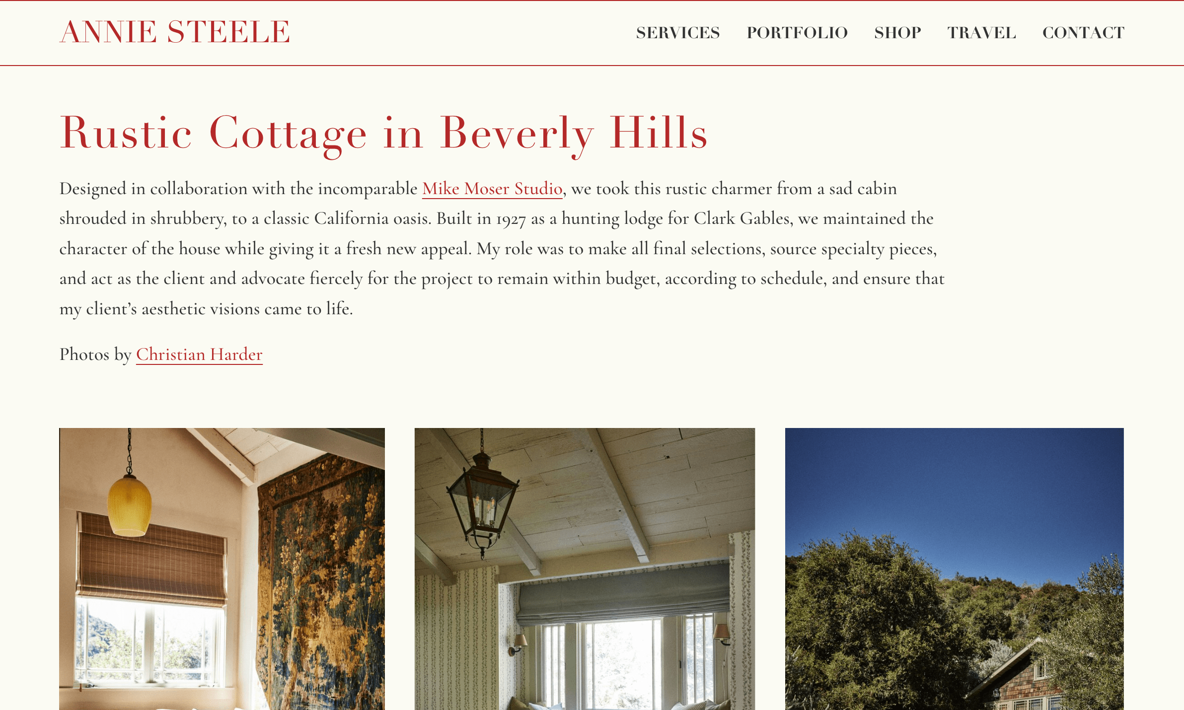
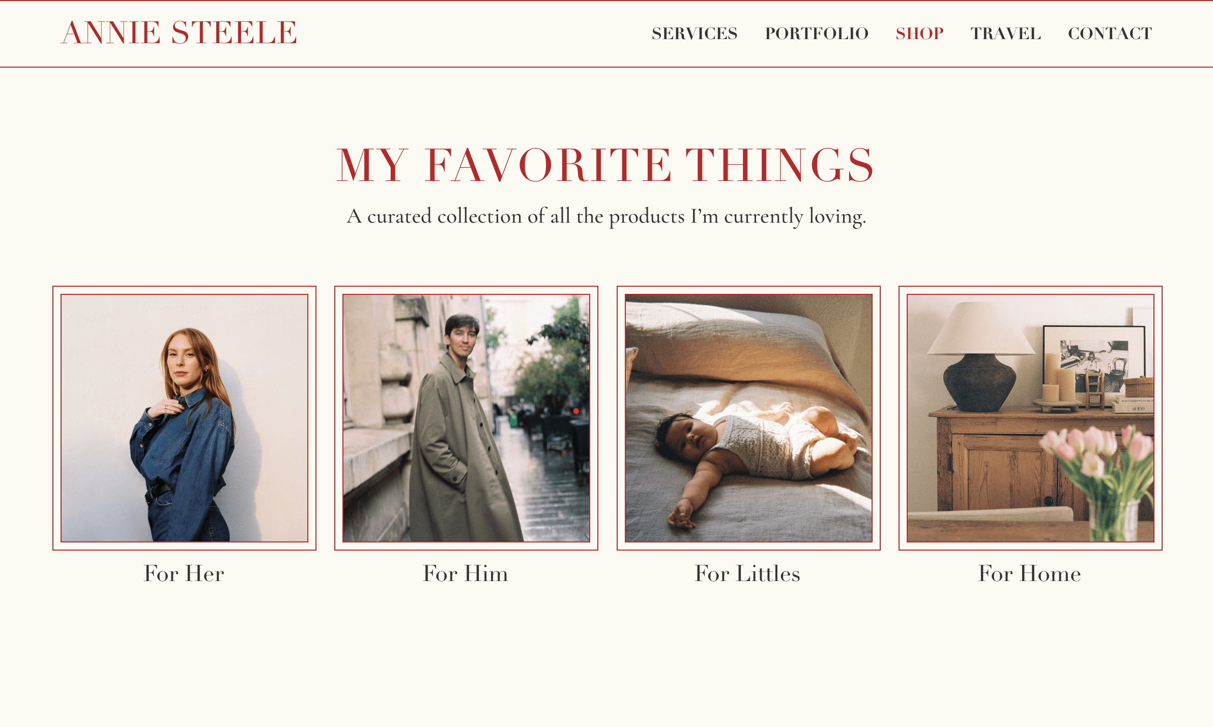
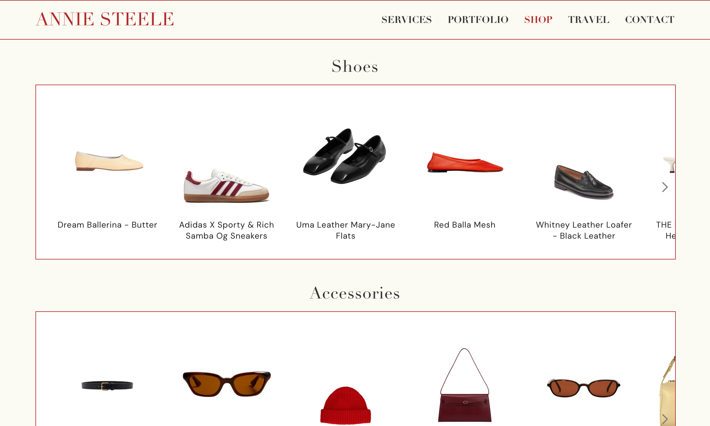
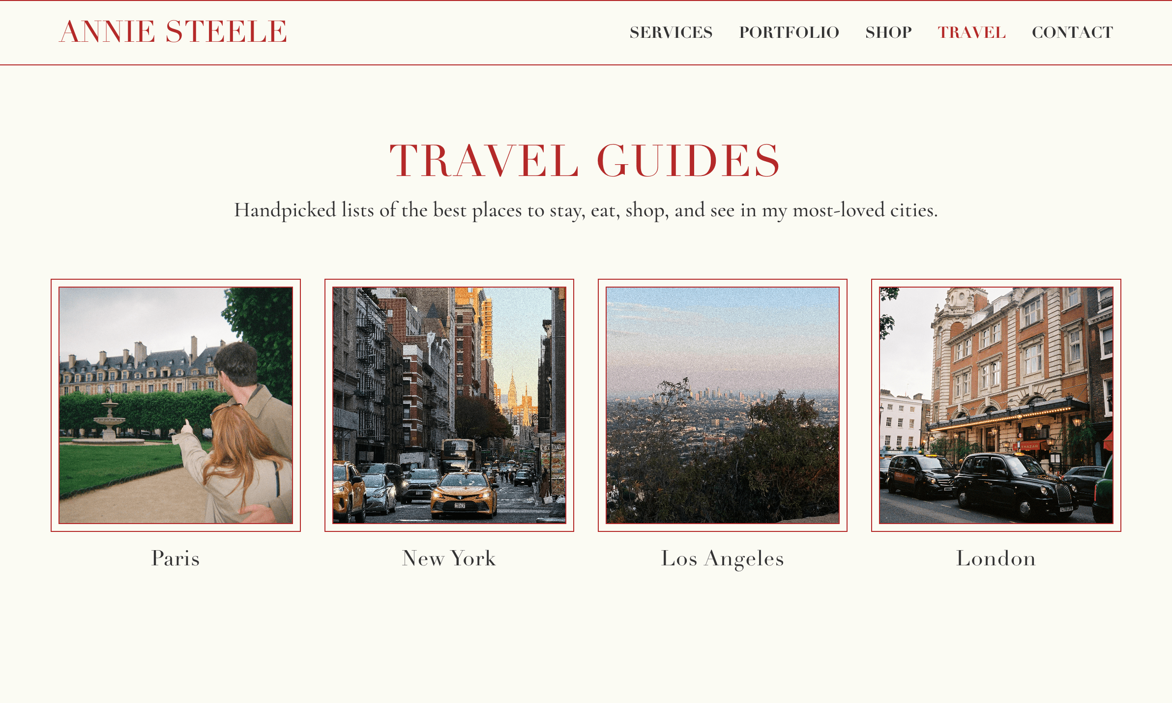
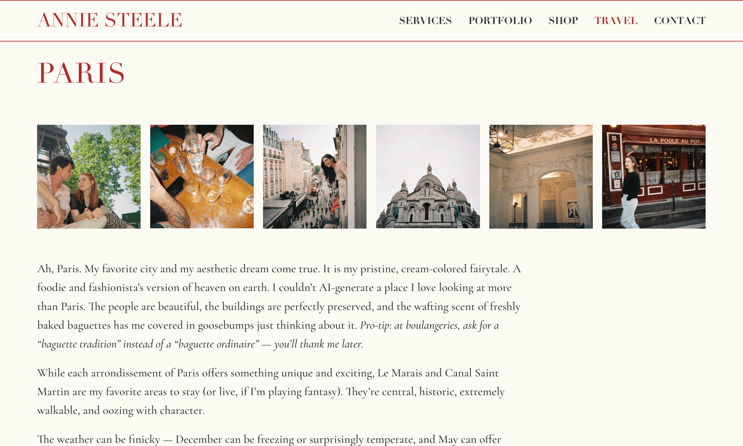
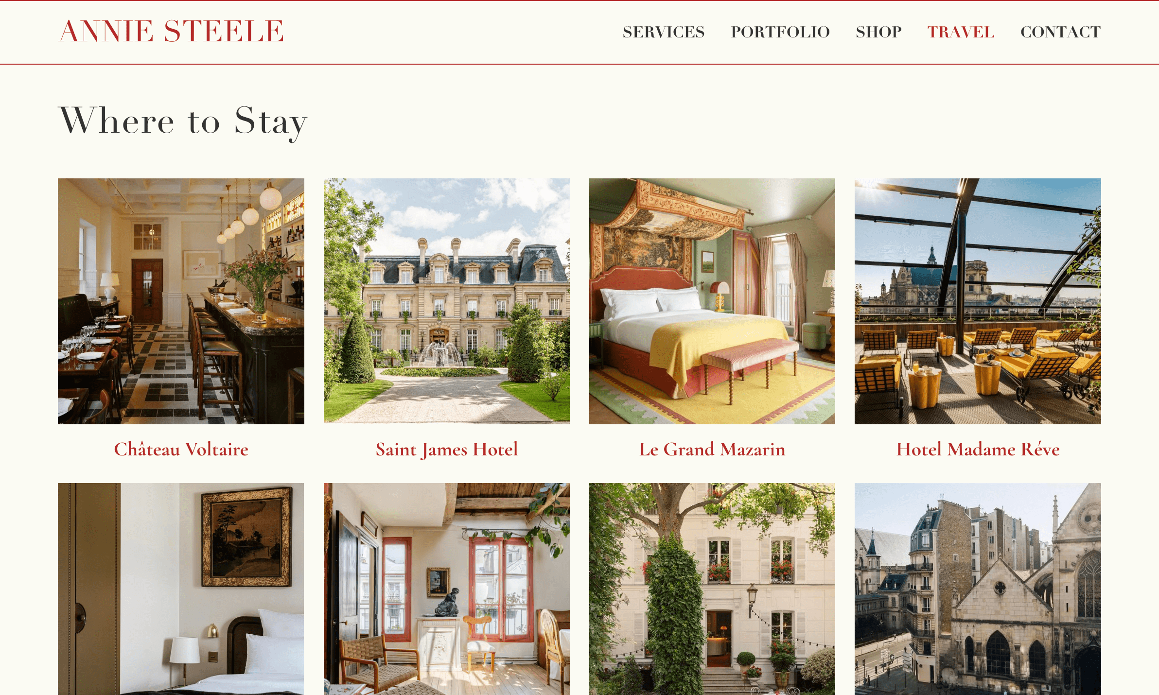
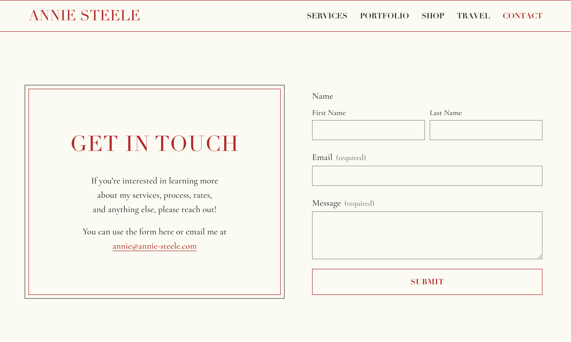
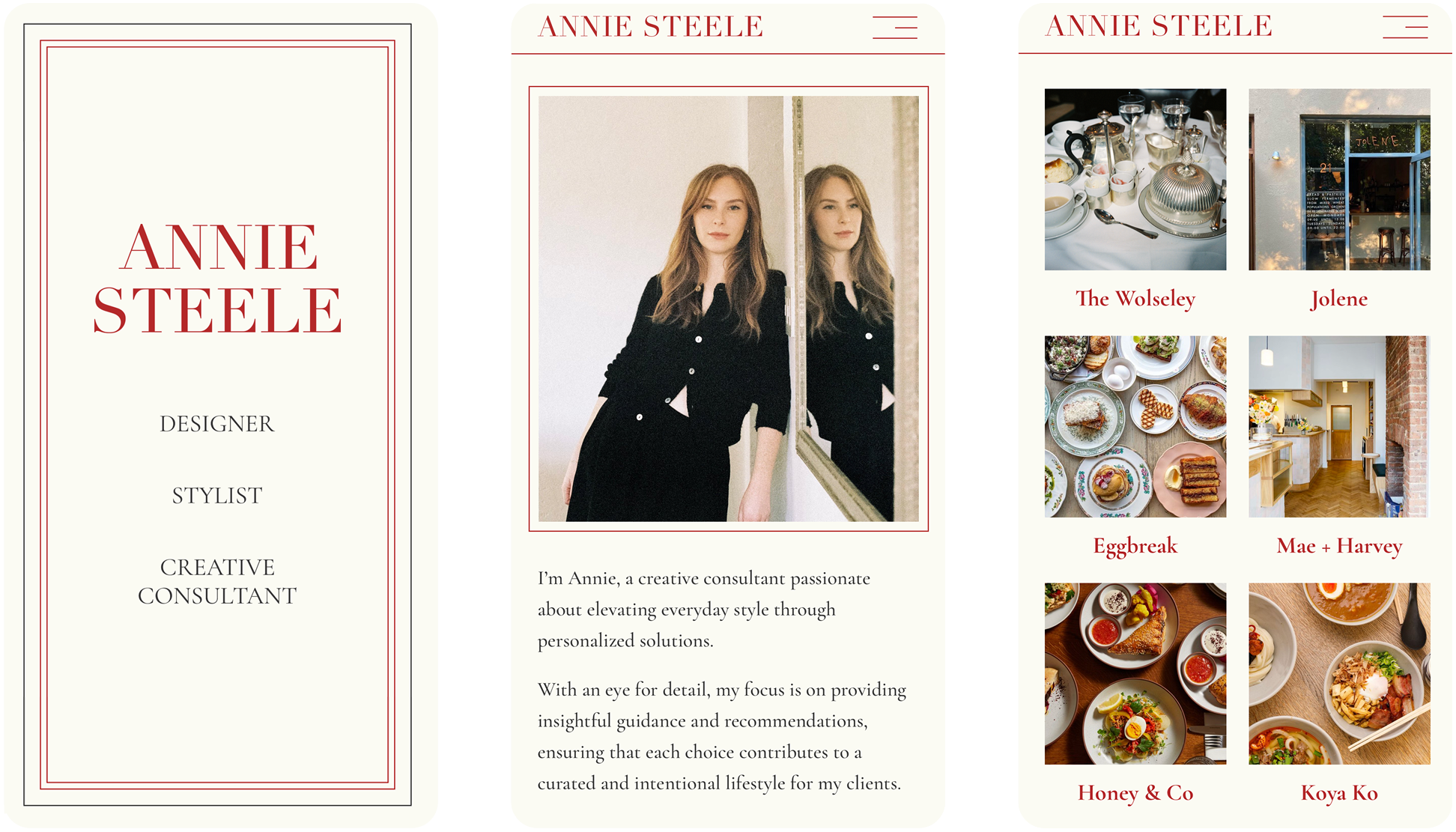
Annie Steele
Annie’s website translates her aesthetic expertise into a digital design inspired by a beloved French notebook. The interface unfolds on a pristine cream canvas accented with bright red—a shade she considers her personal signature. Project photography, travel recommendations, and curated products are displayed with a refreshing airiness, while refined serif typography maintains the vintage stationery aesthetic throughout. Her offerings are presented in bordered panels reminiscent of carefully pasted cards in a scrapbook, while her travel recommendations unfold as if leafing through a well-worn travel diary. The limited color palette emphasizes Annie’s sophisticated eye, while the intuitive backend allows her to continually update her recommendations—creating an online experience that feels like browsing the personal notebook of a trusted style confidante.
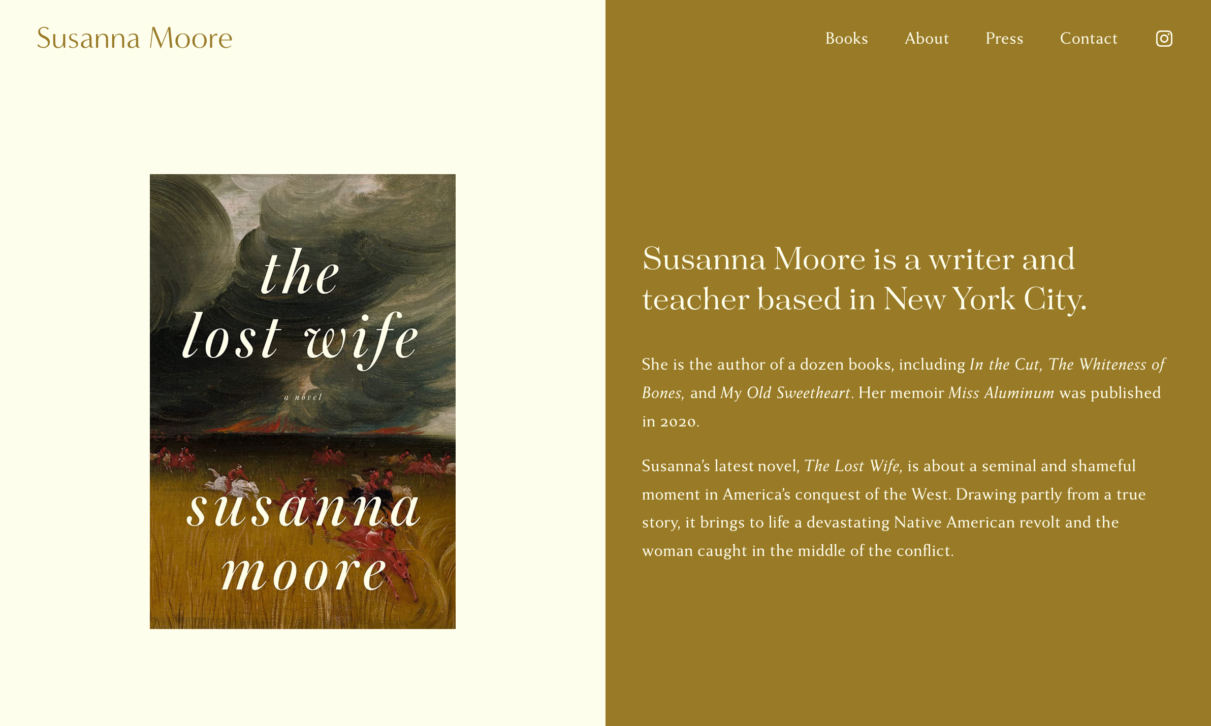
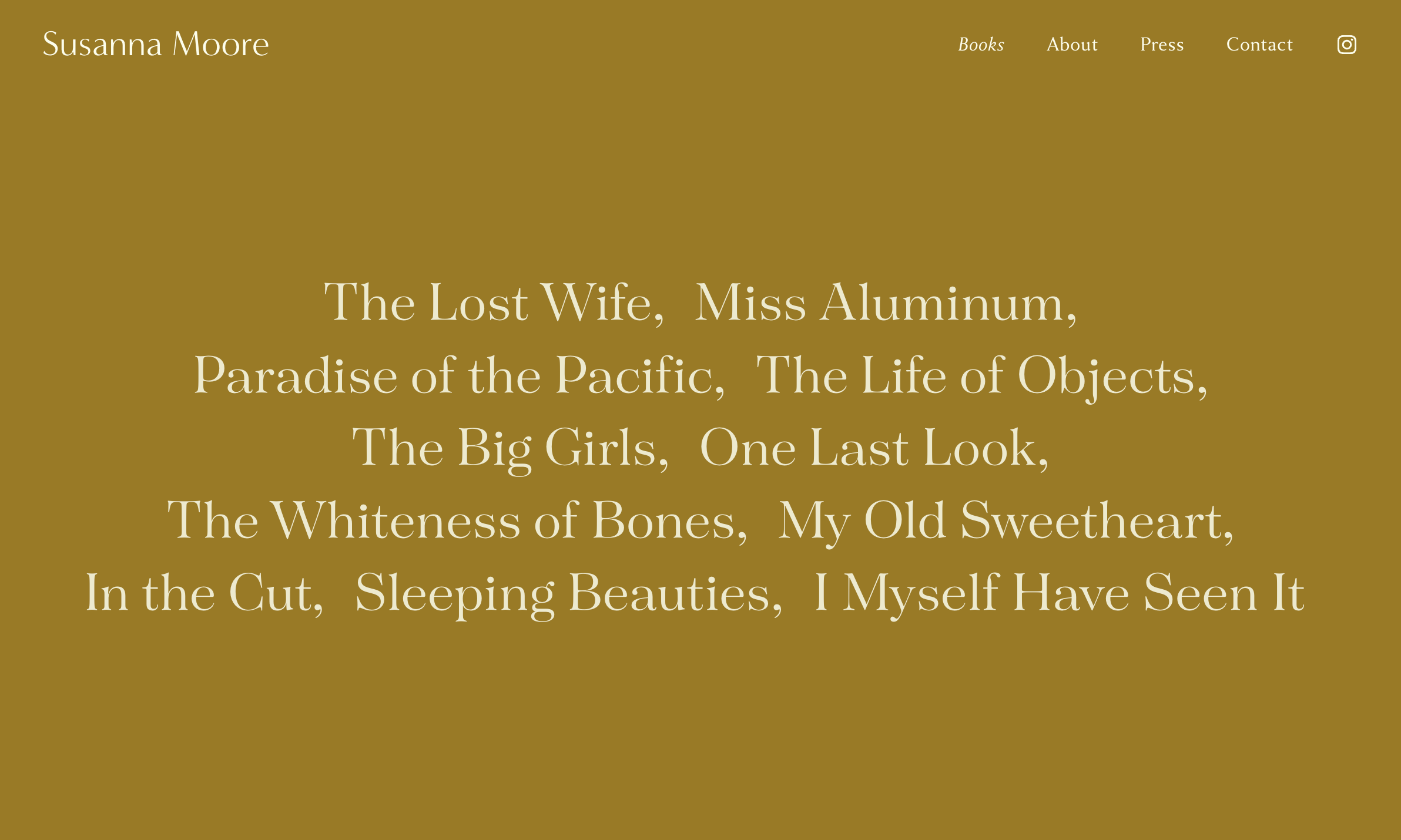
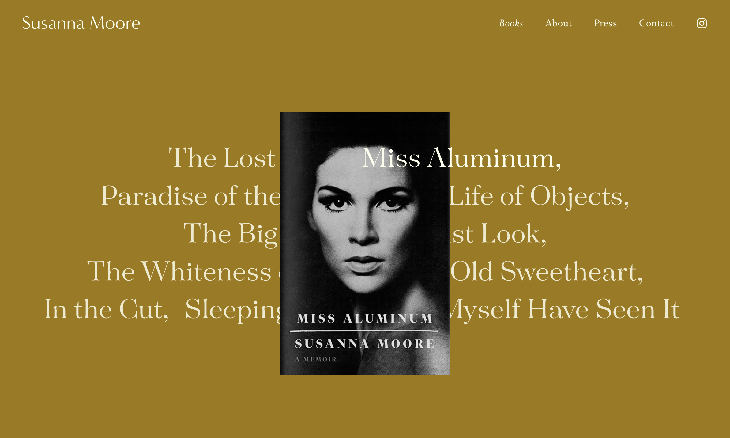
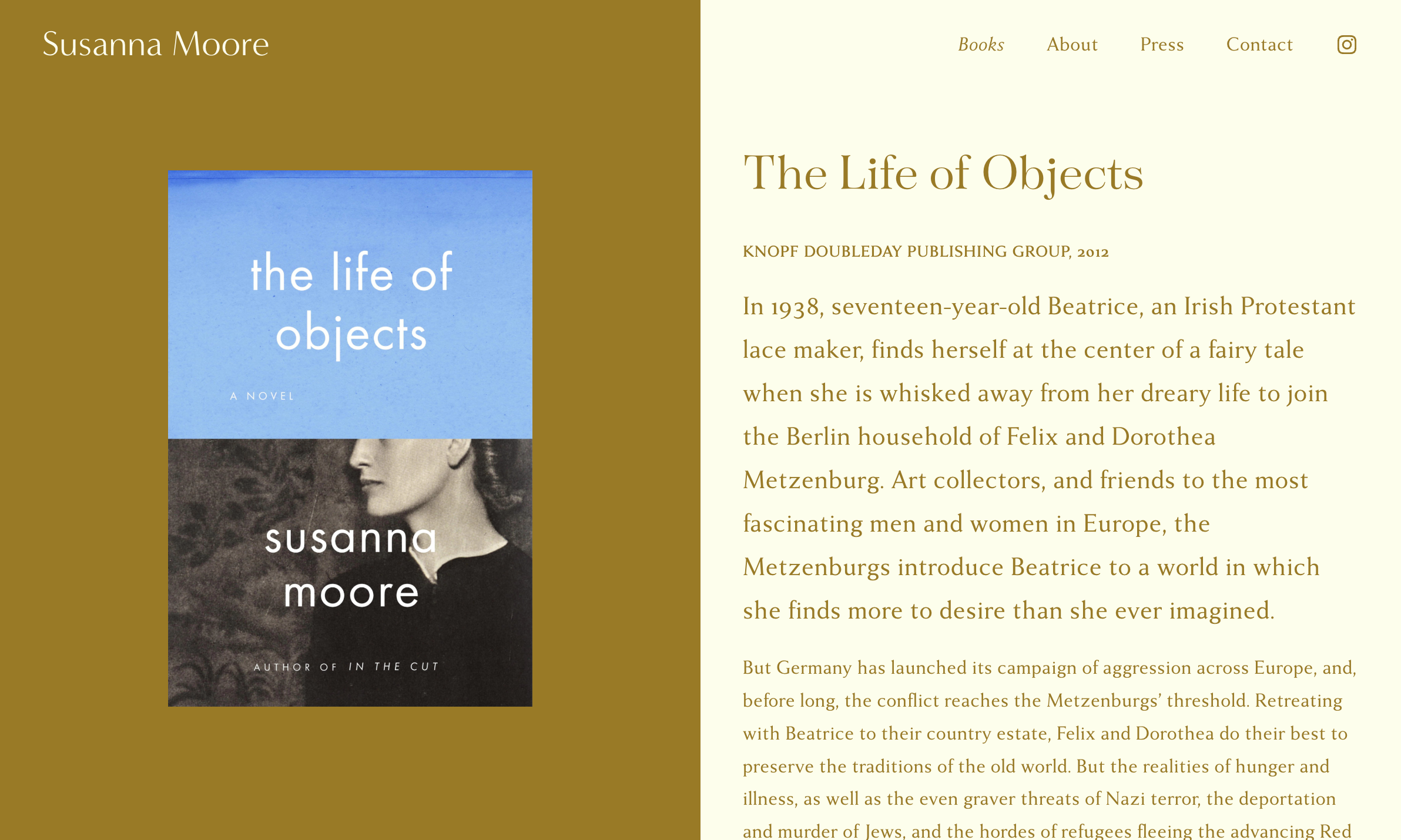
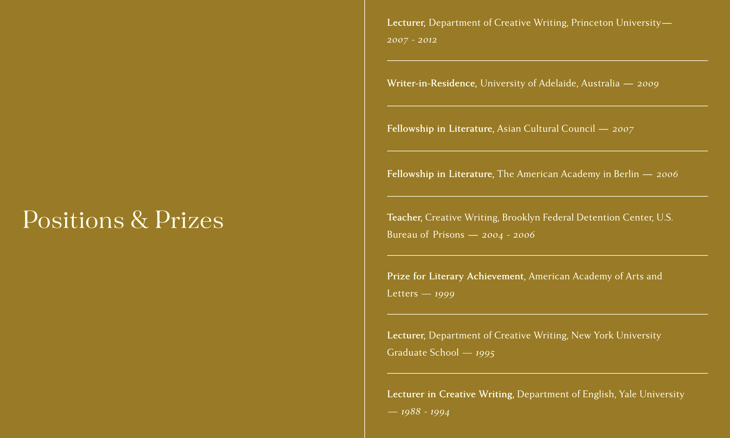
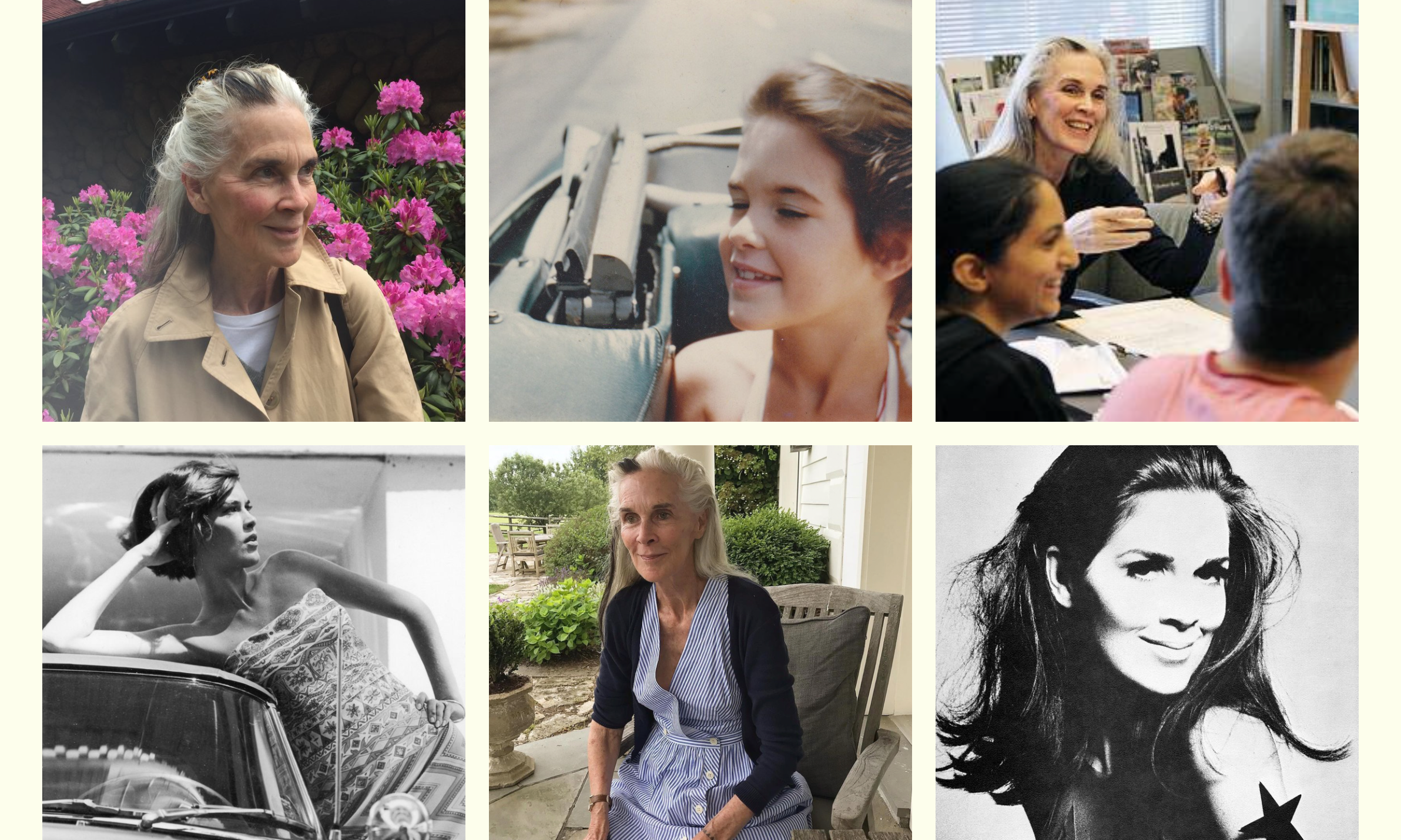
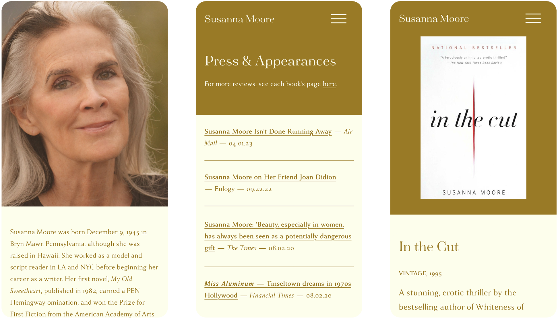
Susanna Moore
Susanna’s site engages visitors through a rich golden backdrop that embodies the gravitas of her career, while providing a welcoming and contemplative space for her words to resonate. The design employs a simple split-screen approach, which creates a natural framing device for her book covers and biographical content. Typography plays a central role with refined serif fonts that convey both literary tradition and timeless elegance, particularly evident in the display of her book titles which float across the screen like chapters in an unfolding narrative. The design thoughtfully positions her books’ covers against the golden field, creating a gallery-like presentation that honors each work while maintaining visual cohesion. In general, the restraint of the design is meant to mirror both Susanna’s dignified personal presence and the searing sparseness of her prose.
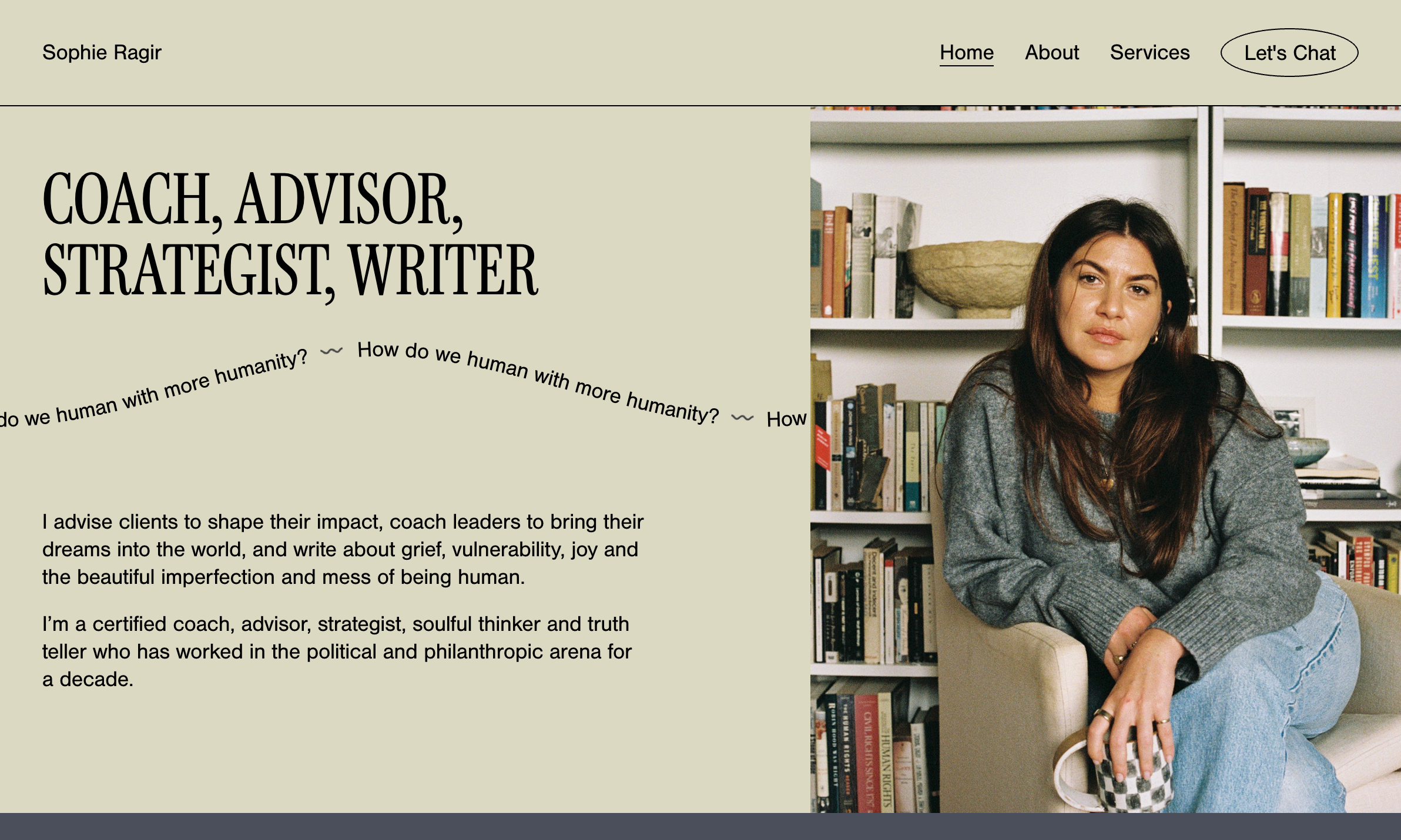
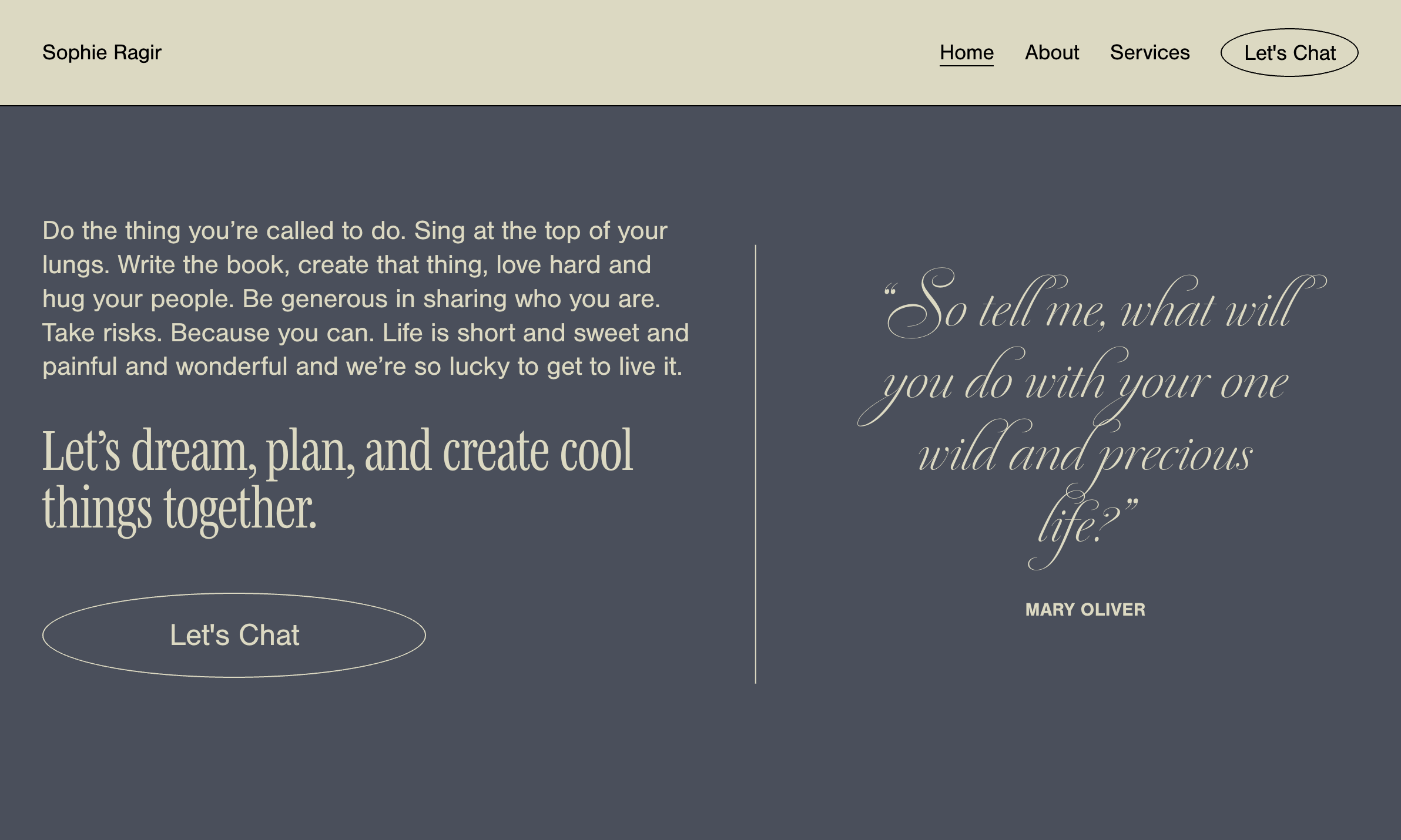
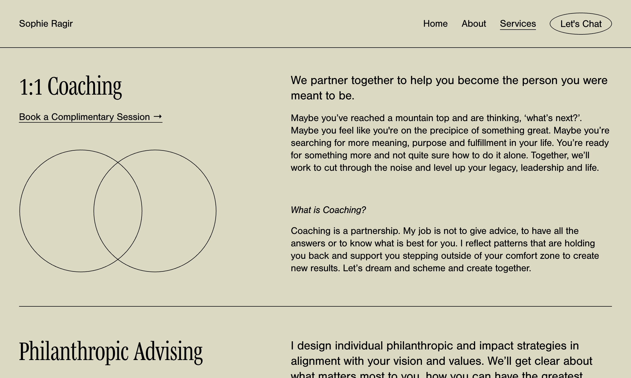
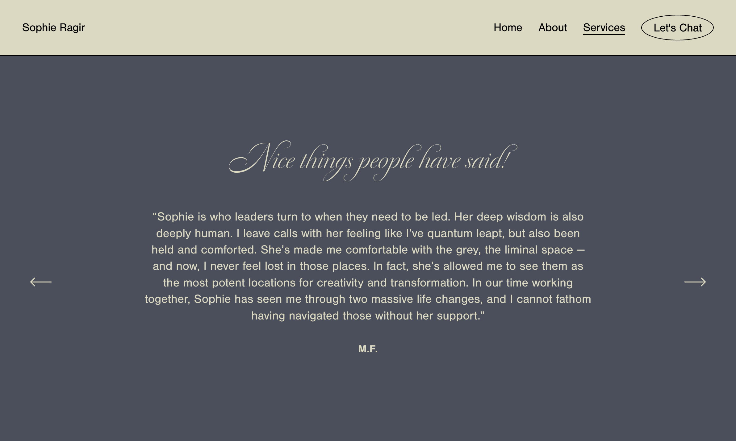
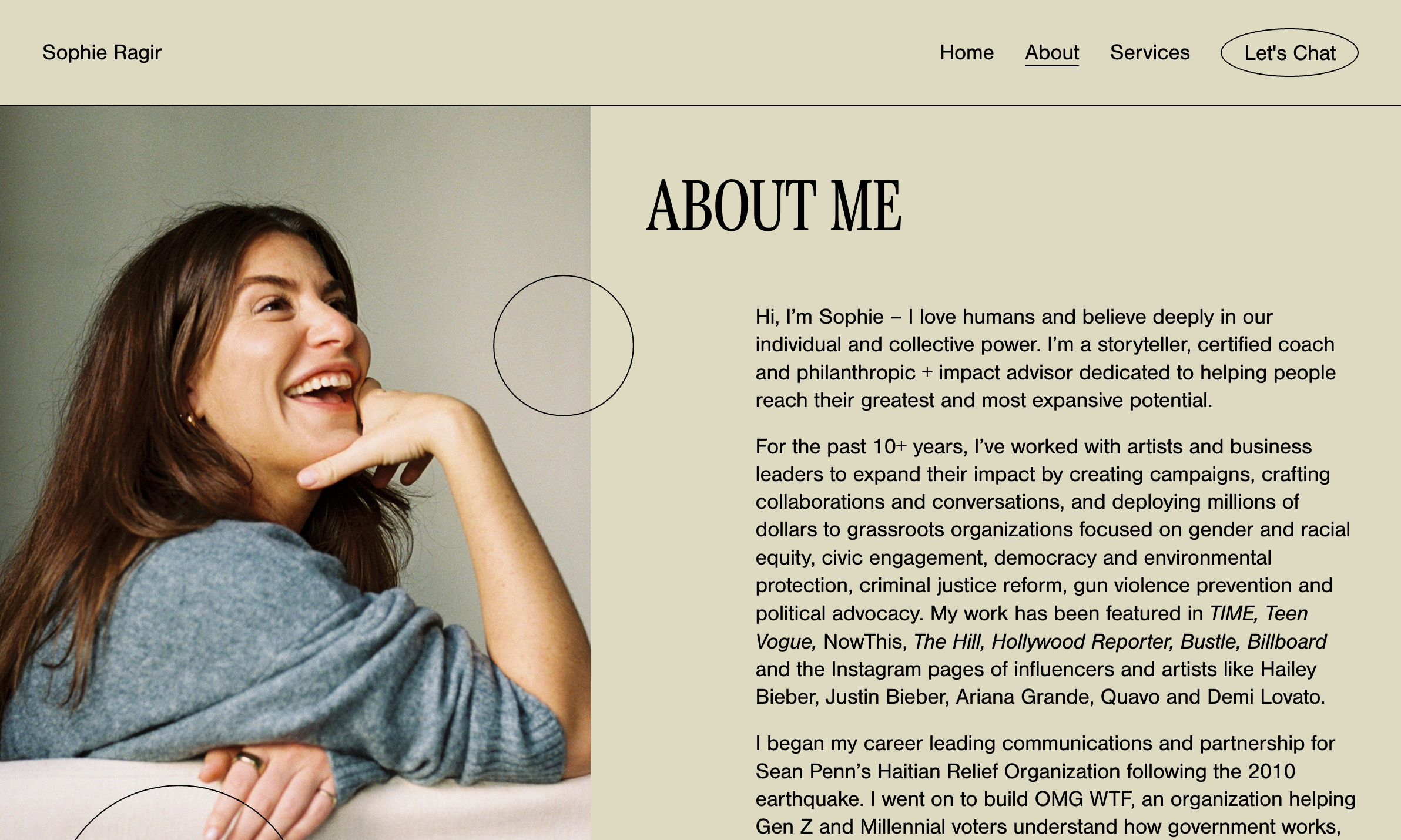
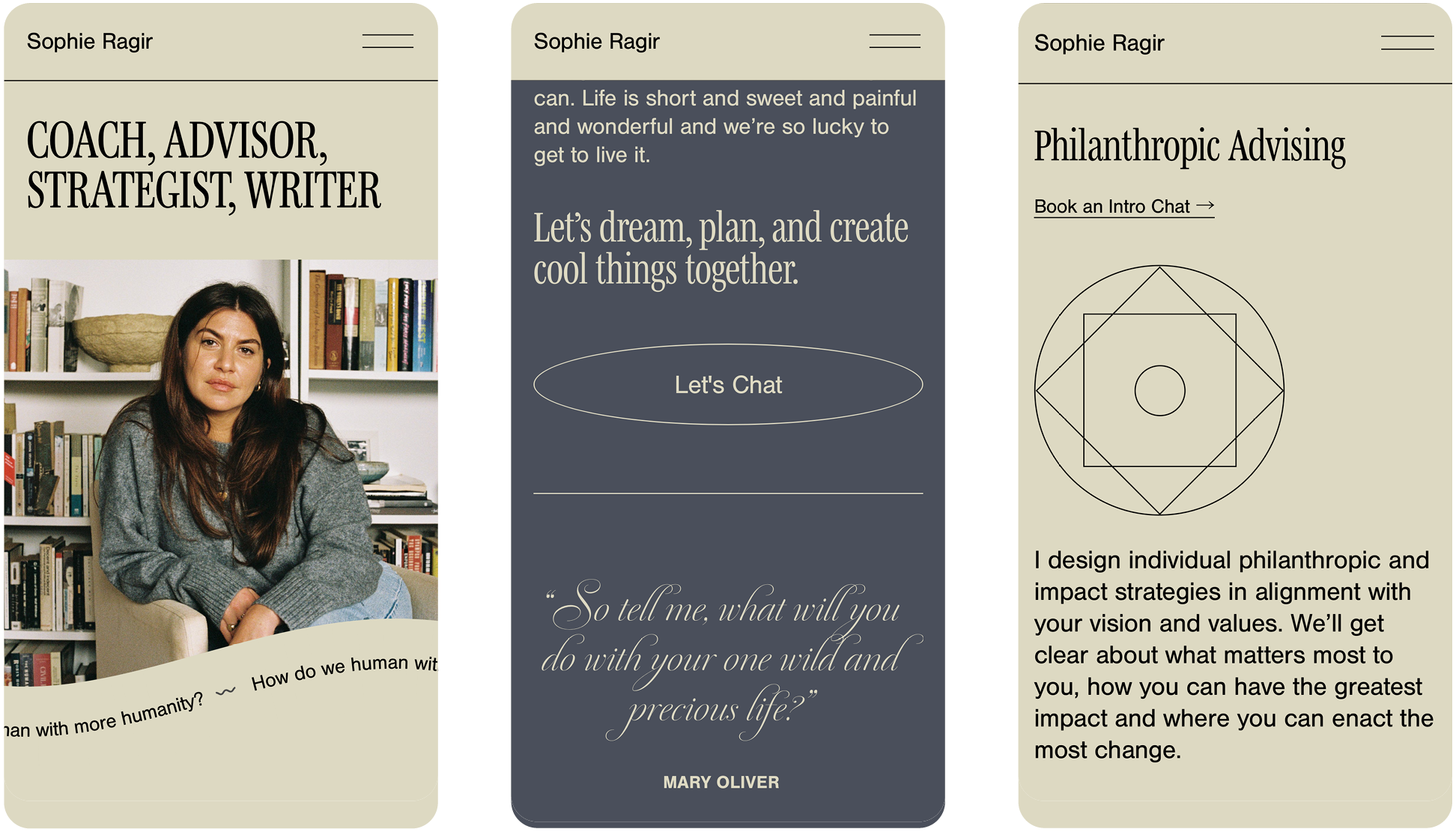
Sophie Ragir
Sophie is a a coach, advisor, and strategist, so her website needed to balance warmth and professionalism. A soothing palette grounds the space, while candid, joyful photography establishes immediate emotional connection. Typography shifts purposefully between bold serifs for key services and an elegant, but playful script for testimonials and quotes. Subtle geometric elements—overlapping circles representing partnership, thin dividing lines, and minimalist outlined buttons—create visual rhythm without overwhelming the content. The navigation remains simple with a prominent call-to-action button that reinforces the conversational nature of her work. The overall design embodies Sophie’s mission—spacious, uncluttered, and focused on meaningful human connection rather than unnecessary embellishment.
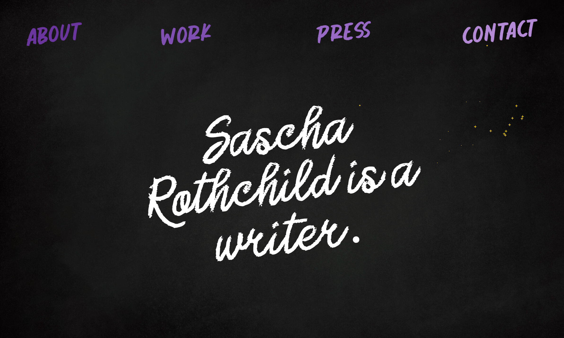
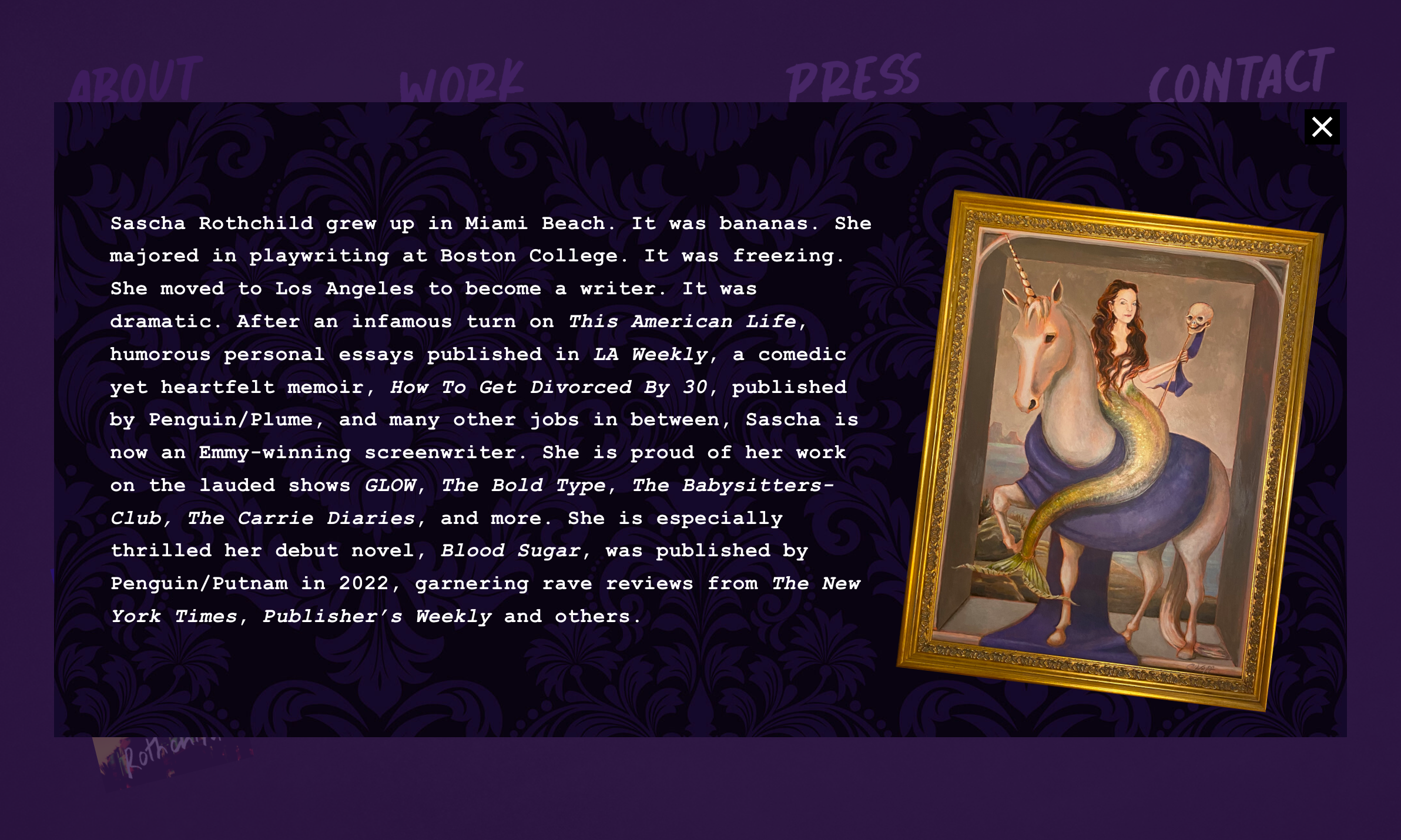
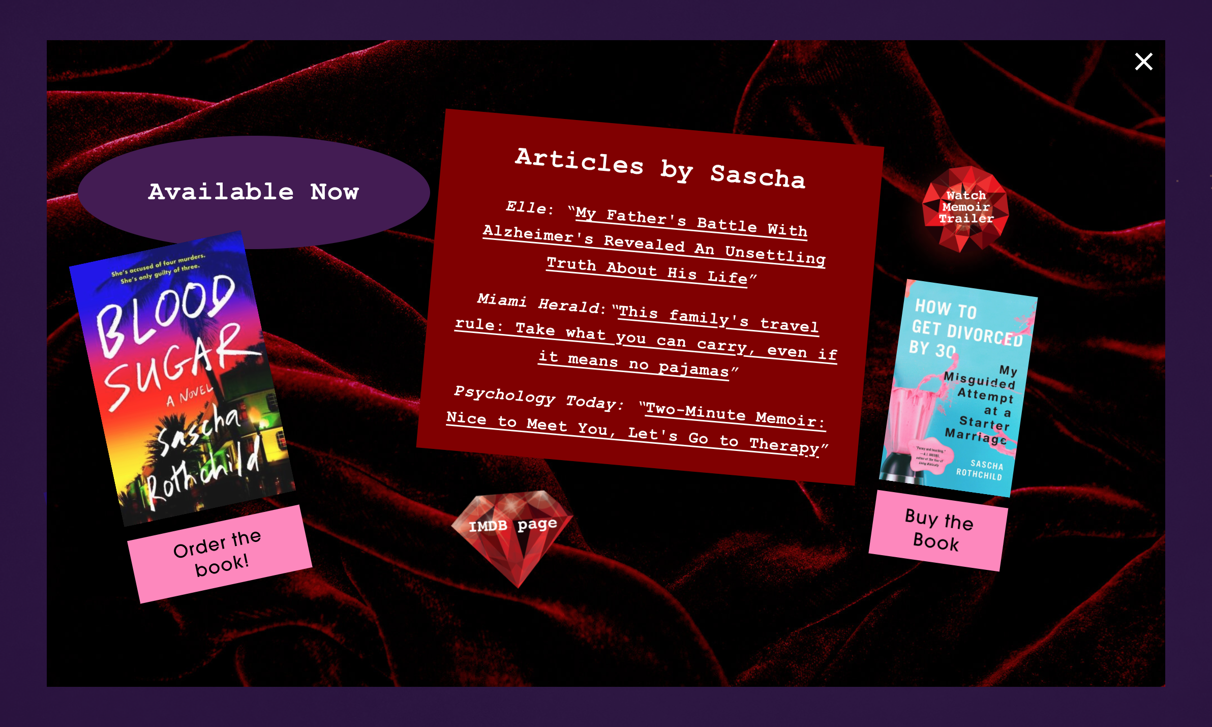
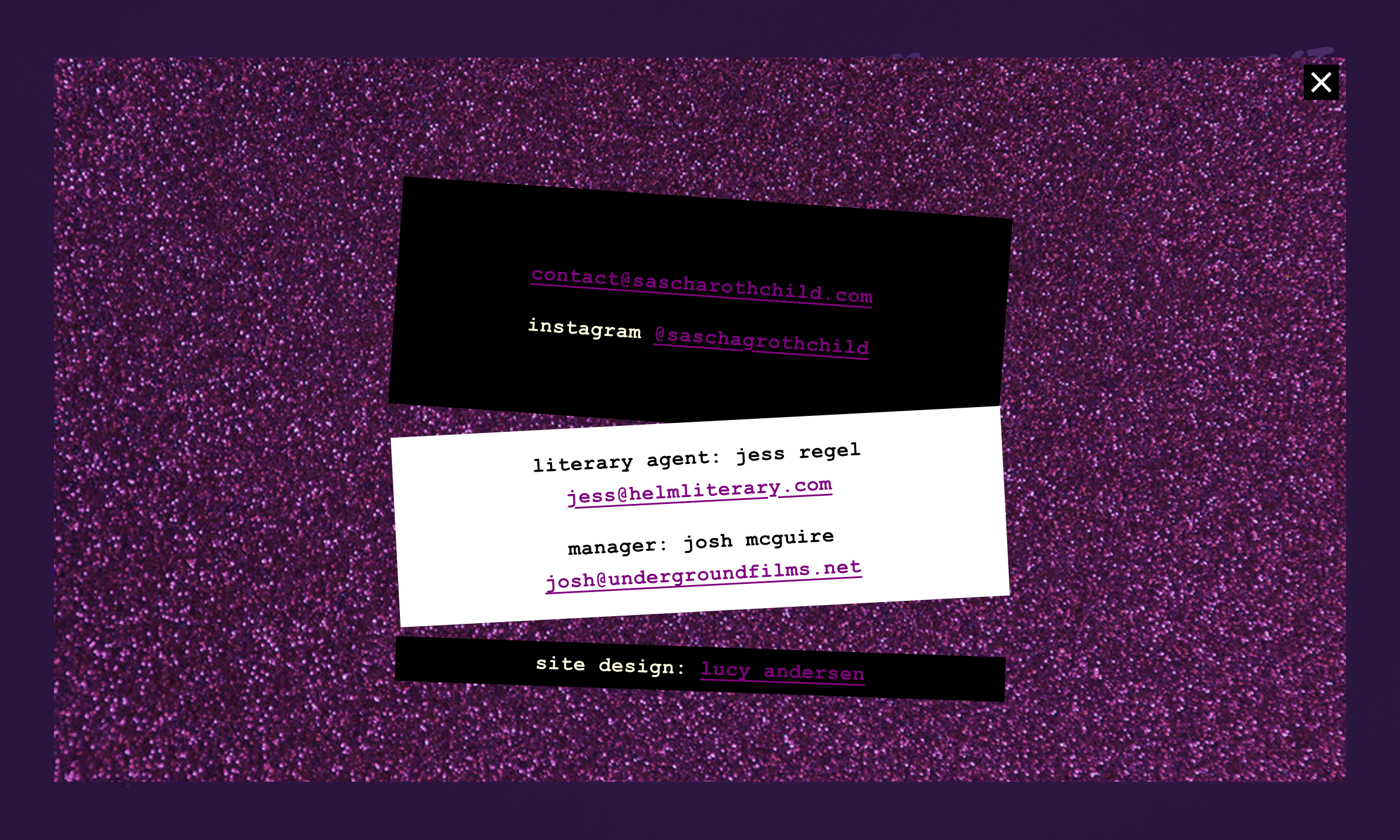
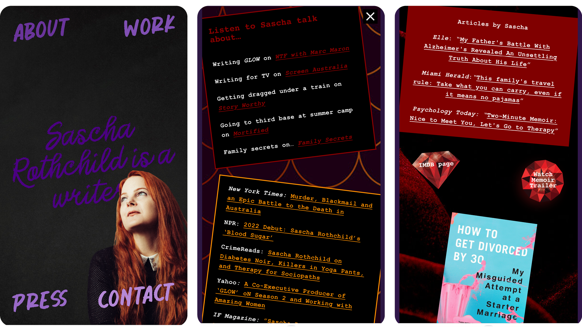
Sascha Rothchild
Sascha’s website bursts with personality through a design that feels like flipping through your teenage scrapbook. Deep purple and black backgrounds set the stage for electric pink accents and handwritten chalk typography. Content appears in interactive pop-up panels like the posters and diary pages of your childhood bedroom, complete with textured backgrounds from velvet-like surfaces to glittering purple sparkles. The playful experience extends to user interaction, with the cursor leaving a trail of sparkling pixie dust as it moves across the screen. Whimsical elements—diamond graphics, tilted text boxes, and quirky framed artwork—create the perfect blend of kitsch and polish that mirrors Sascha’s writing voice and connects authentically with her audience.