The Dial
The Dial is an online magazine of culture, politics, and ideas with a focus on locally sourced writing from around the world. The original publication was founded in 1840 with a mission to create a “journal in a new spirit”. Over the course of the following century, the magazine reinvented itself several times, and in 2023, the current iteration was born. The new Dial builds upon its rich literary history, but with a 21st century eye toward reporting and international dialogue.
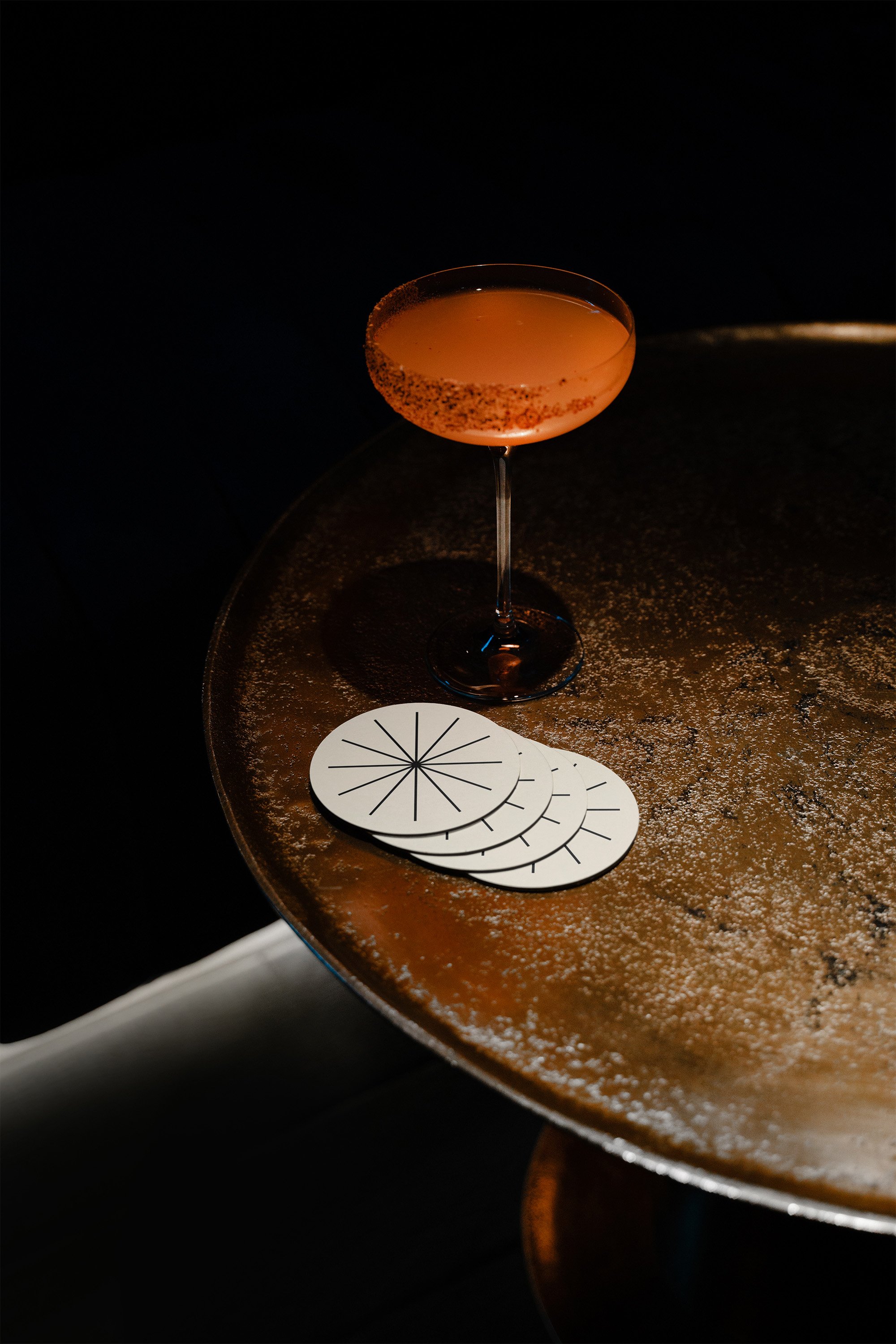
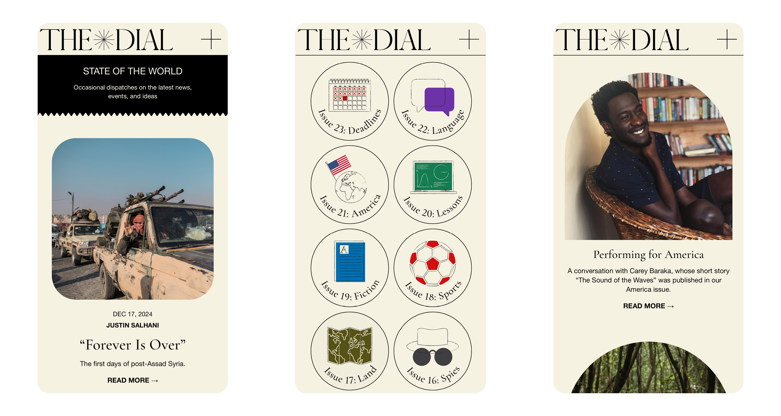
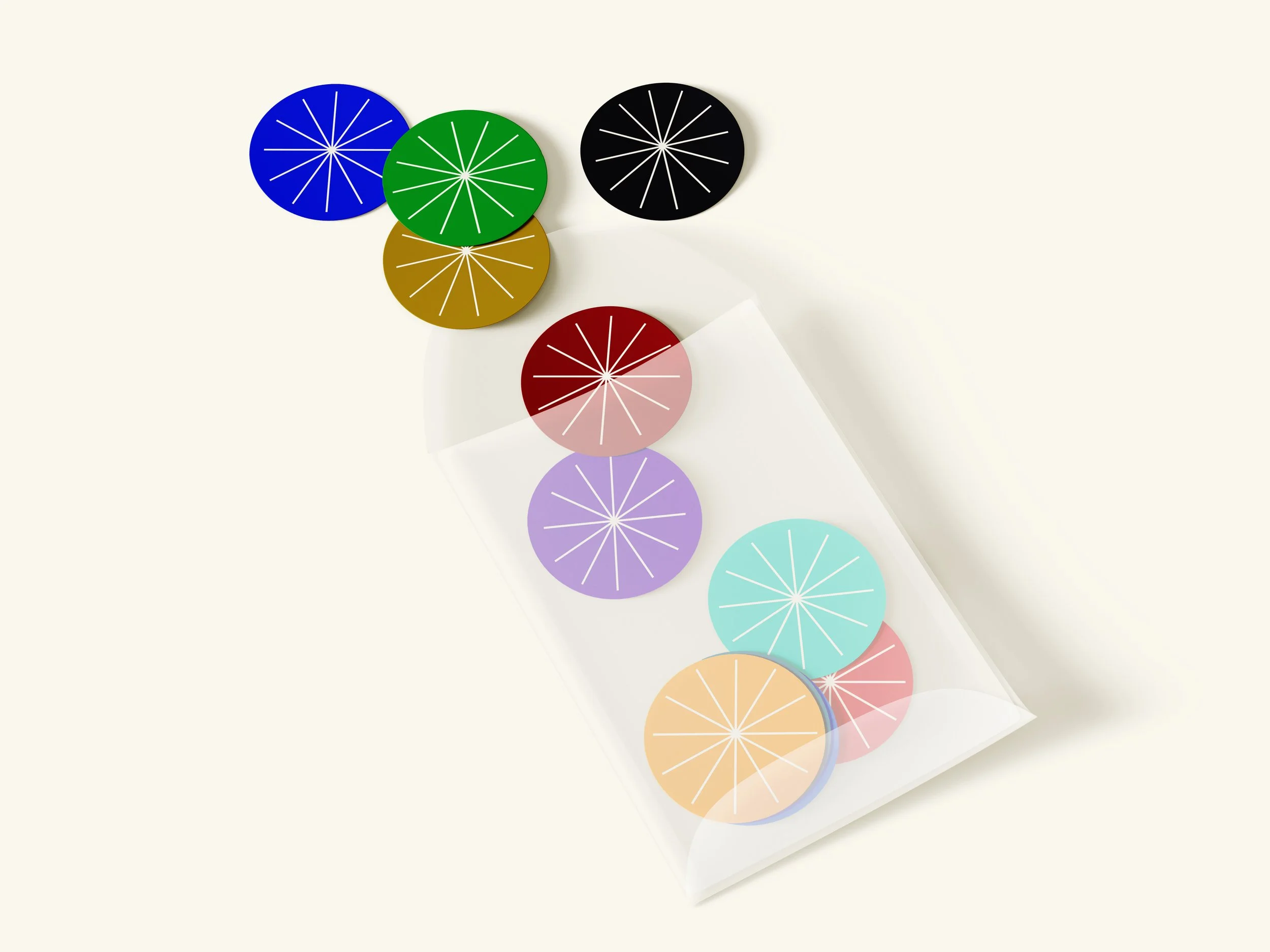
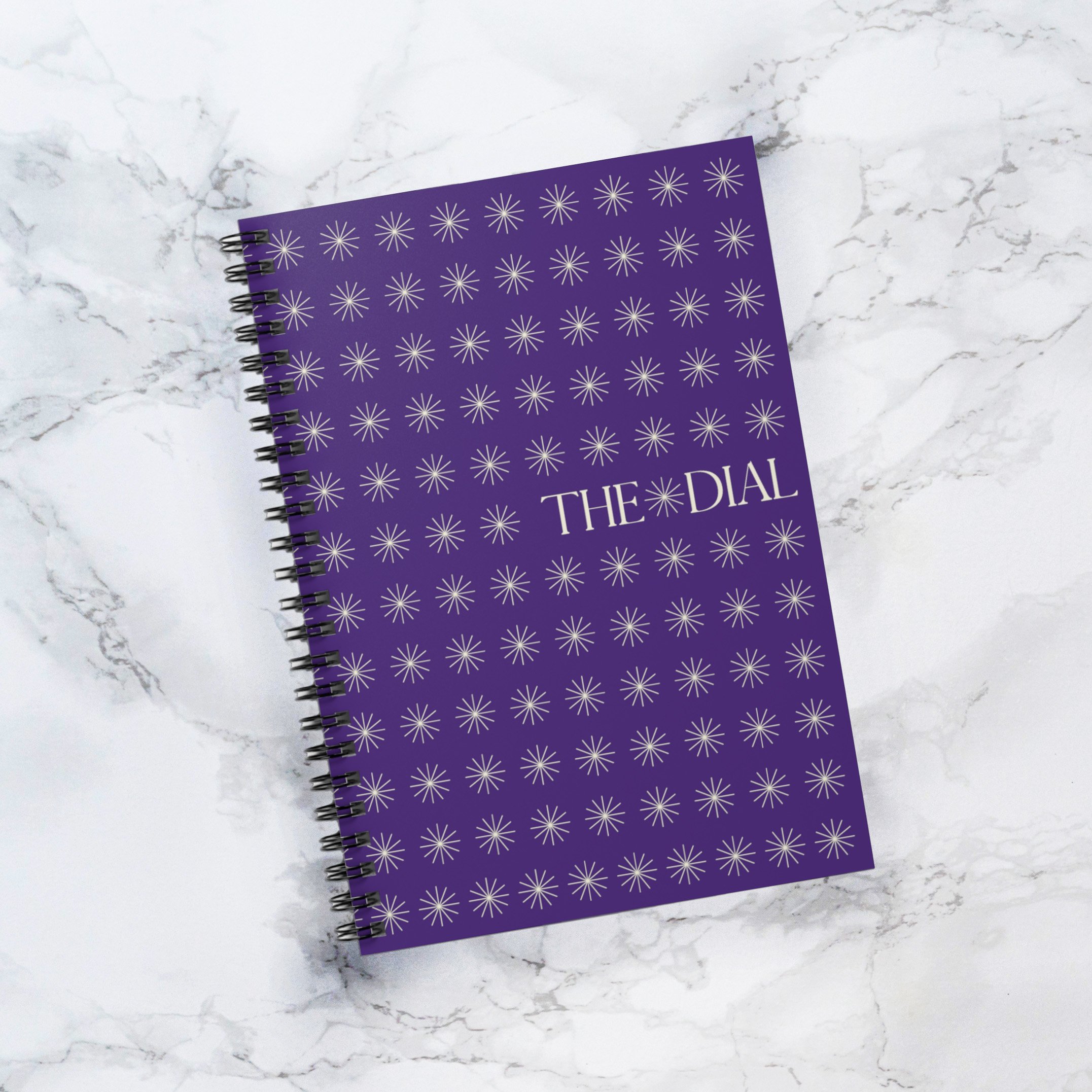
Throughout its history, The Dial maintained variations of an all-caps serif logo. The updated design preserves this typographic legacy while introducing a spoked dial emblem—creating a versatile mark for social media and graphic applications.
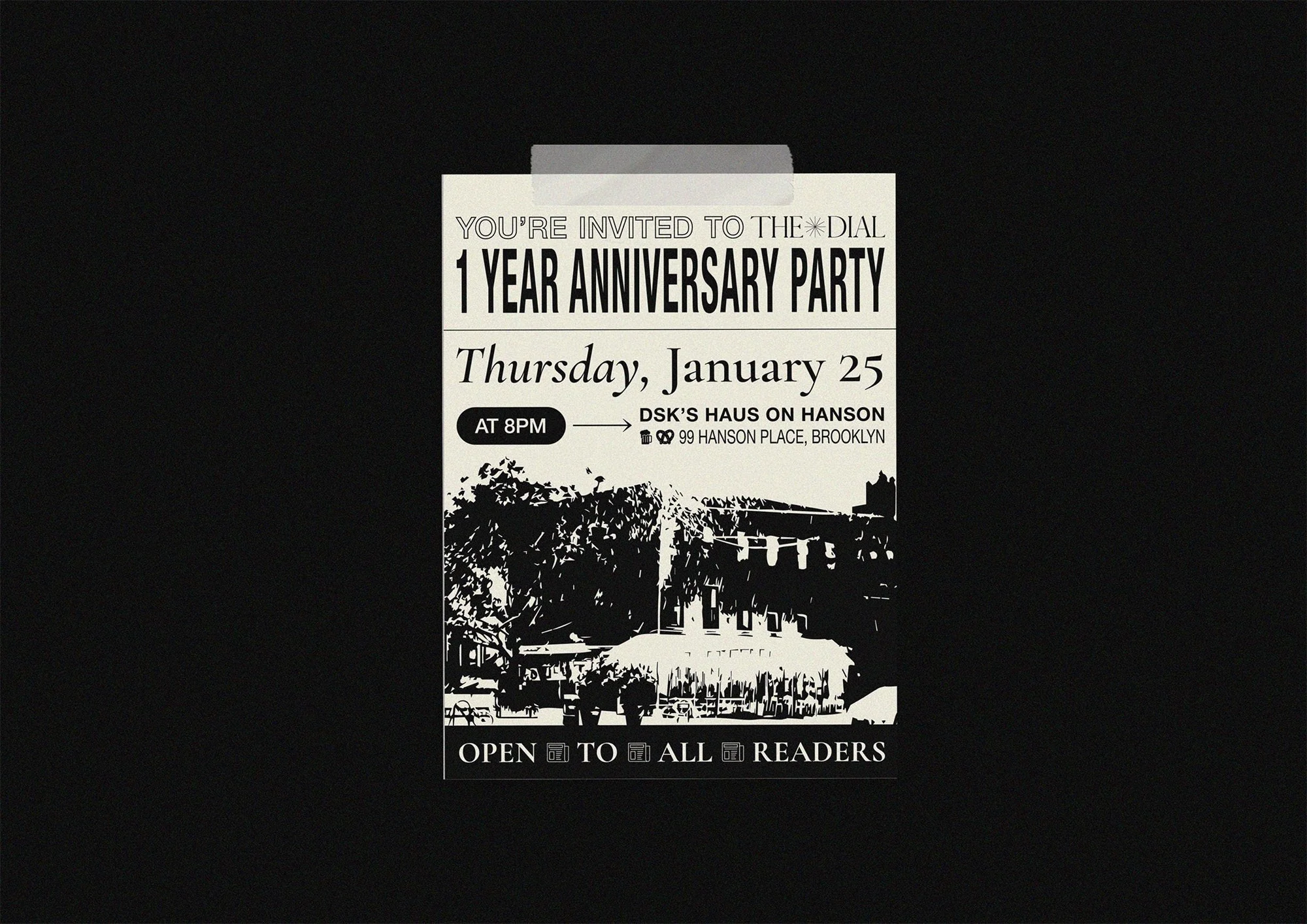
History underpinned a lot of the design choices. The Dial of the 1920s was one of the first magazines to integrate artwork into its literary contributions, so it felt necessary for each piece in the magazine to have a single, strong visual companion. Imagery runs the gamut from custom illustrations in the new, irreverent Dial style to classic editorial photos and historical ephemera.
THEDIAL.WORLD
✺
THEDIAL.WORLD ✺
The brand’s foundational ivory color was sampled directly from historical scans of The Dial, while elements from 19th and 20th century periodicals—serif headlines, dividing lines, decorative arrows, ornaments, and two-color illustrations—ground the digital design in its print heritage.
Each monthly themed issue introduces a new accent color, creating visual variety while maintaining the magazine’s cohesive aesthetic.


