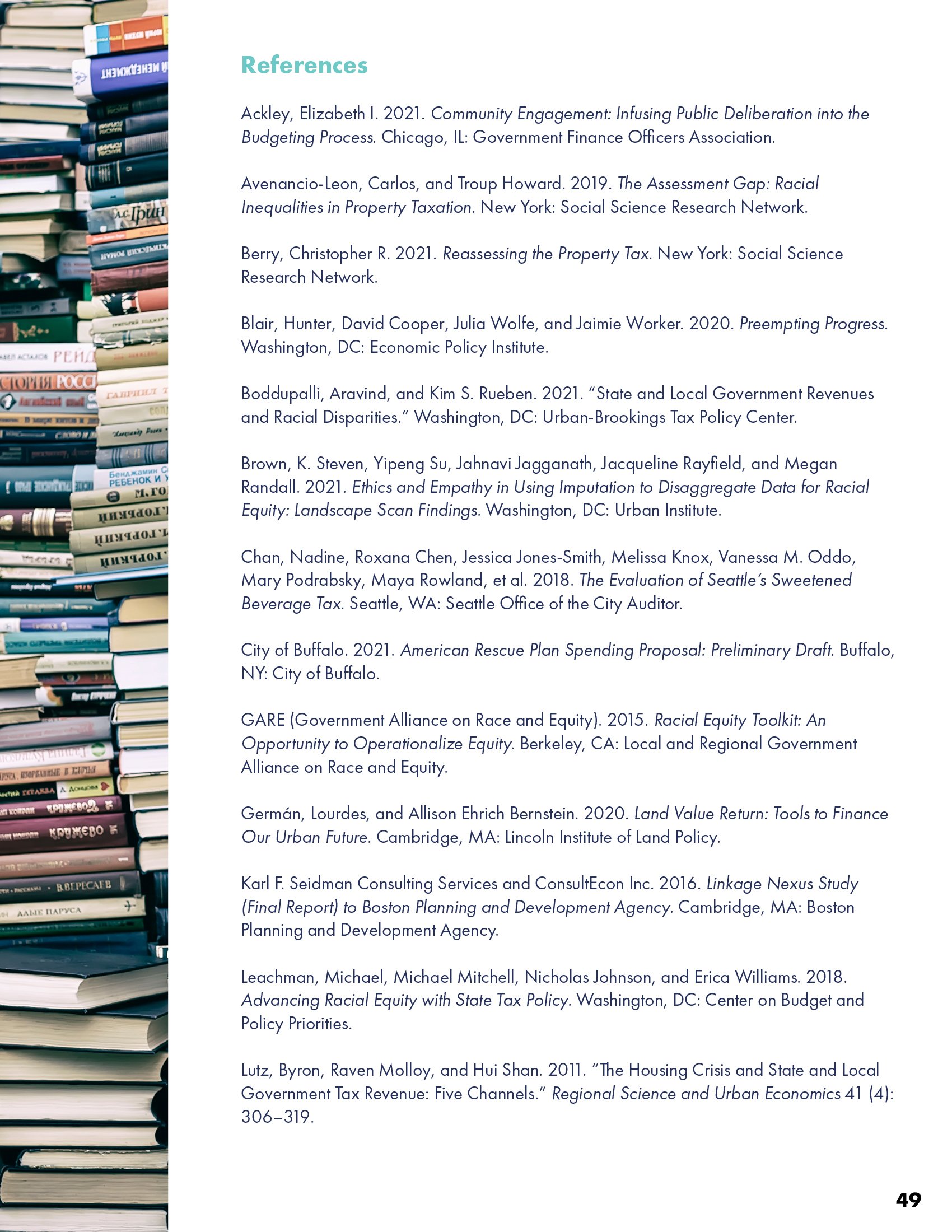
Impact Reports
EDITORIAL DESIGN
PRINT + DIGITAL DESIGN
Working under Buoy’s expert marketing direction, I design annual reports for progressive, mission-driven nonprofits that require sophisticated storytelling and data visualization. These publications—for groups like Results for America, Accountable.US, and What Works Cities—respect each organization’s core identity while pushing their visual language forward. The resulting materials raise the bar for nonprofit communications, helping these groups better engage stakeholders, policymakers, and the communities they serve.

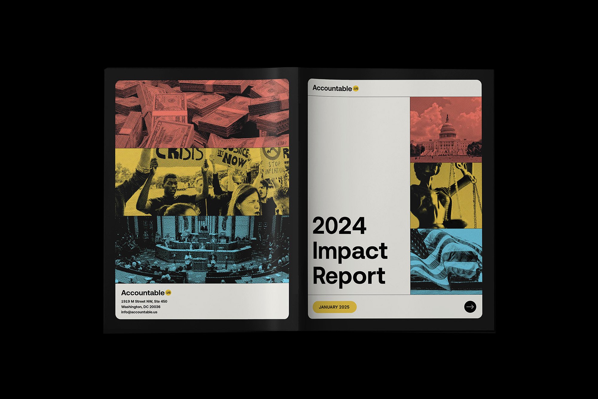
Accountable.US produces incisive research that exposes special interests and drives progressive change. Their annual report takes inspiration from digital communications, incorporating UI elements and pixel-based iconography that nod to the organization’s rapid-response nature. The clean, inviting design transforms their bold investigative work into an accessible narrative while propelling their established brand language into new territory.


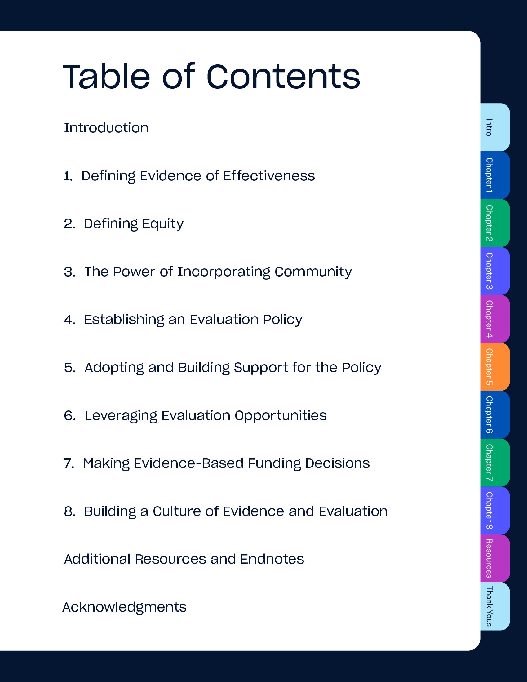
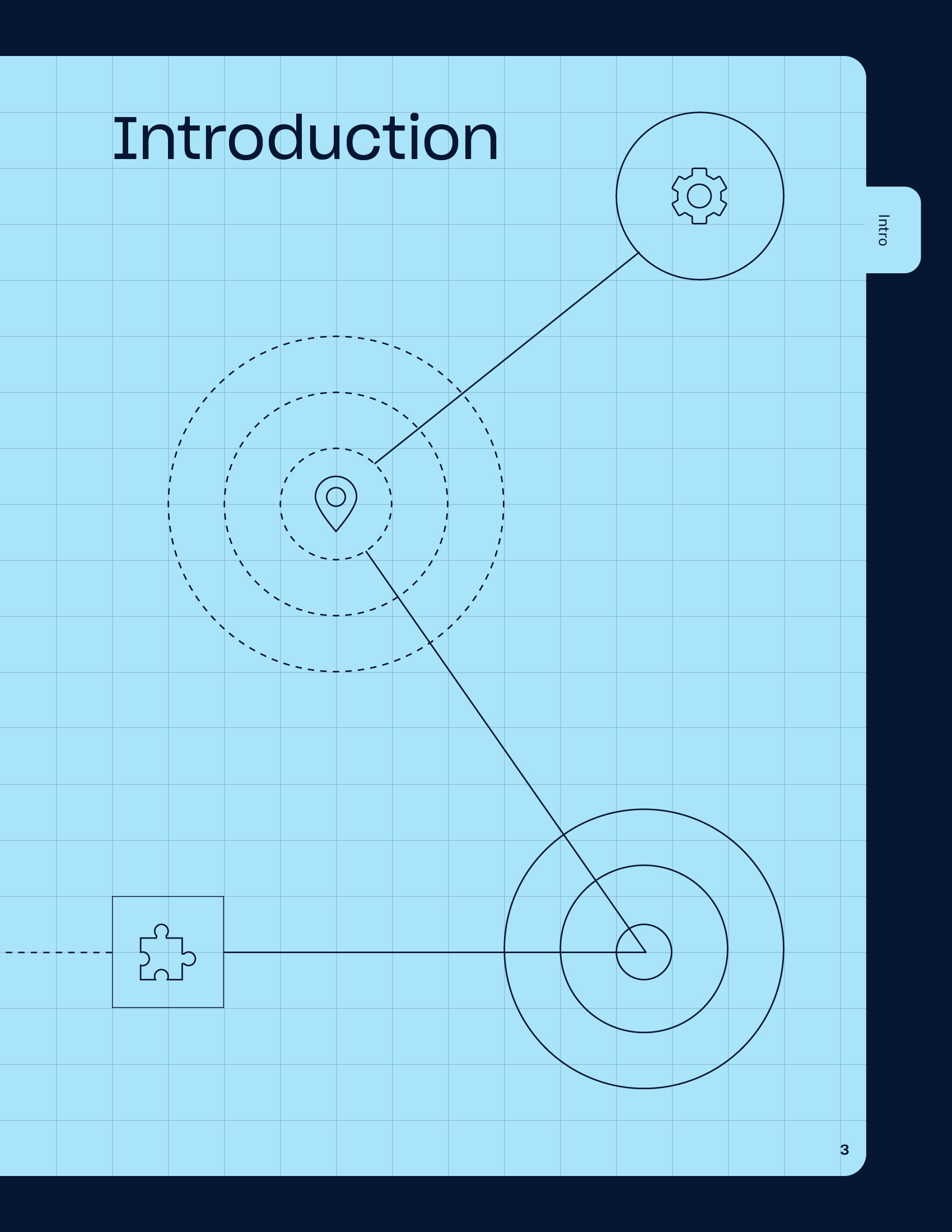
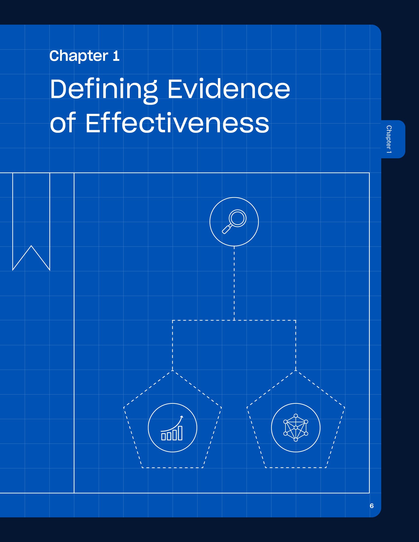
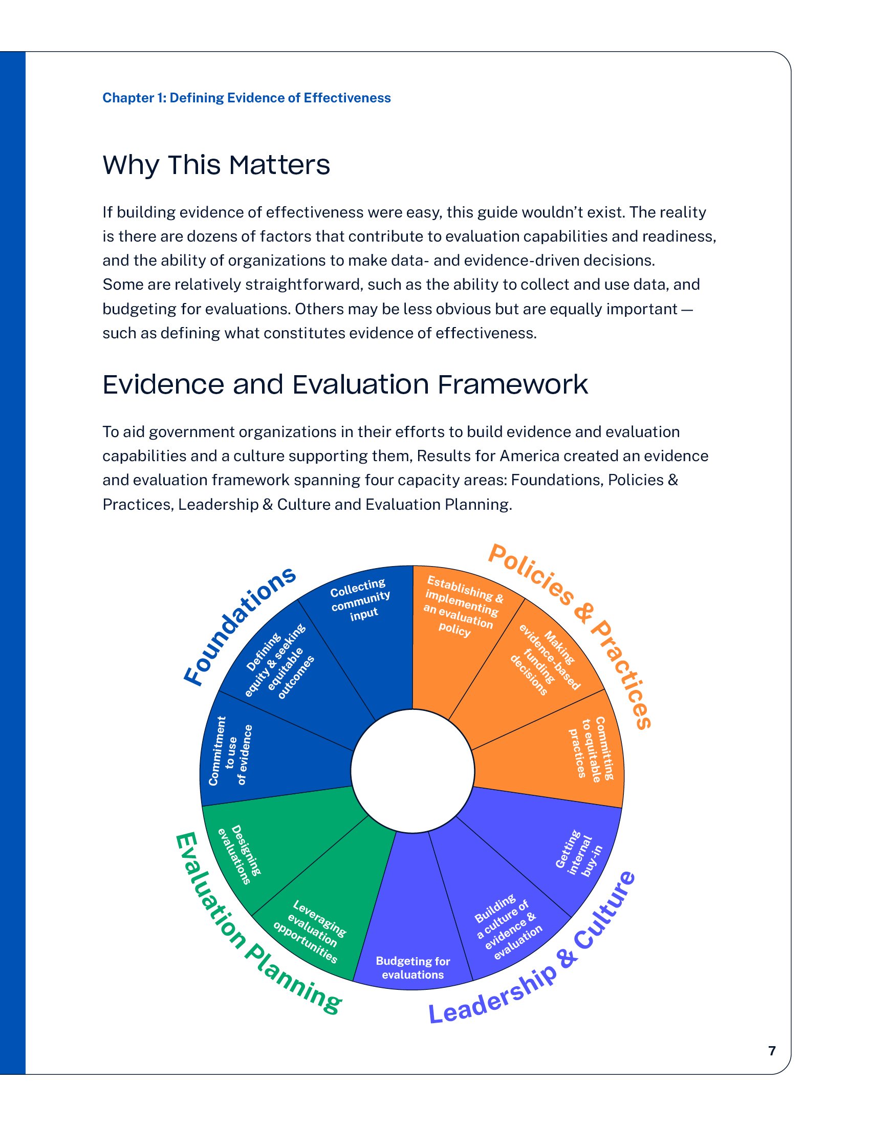
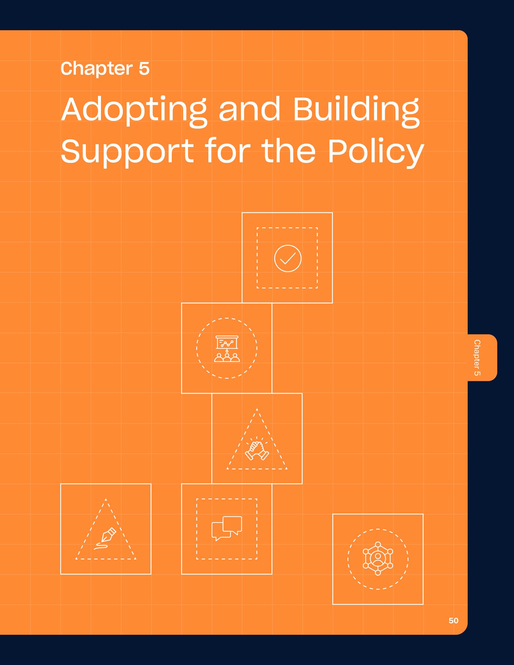
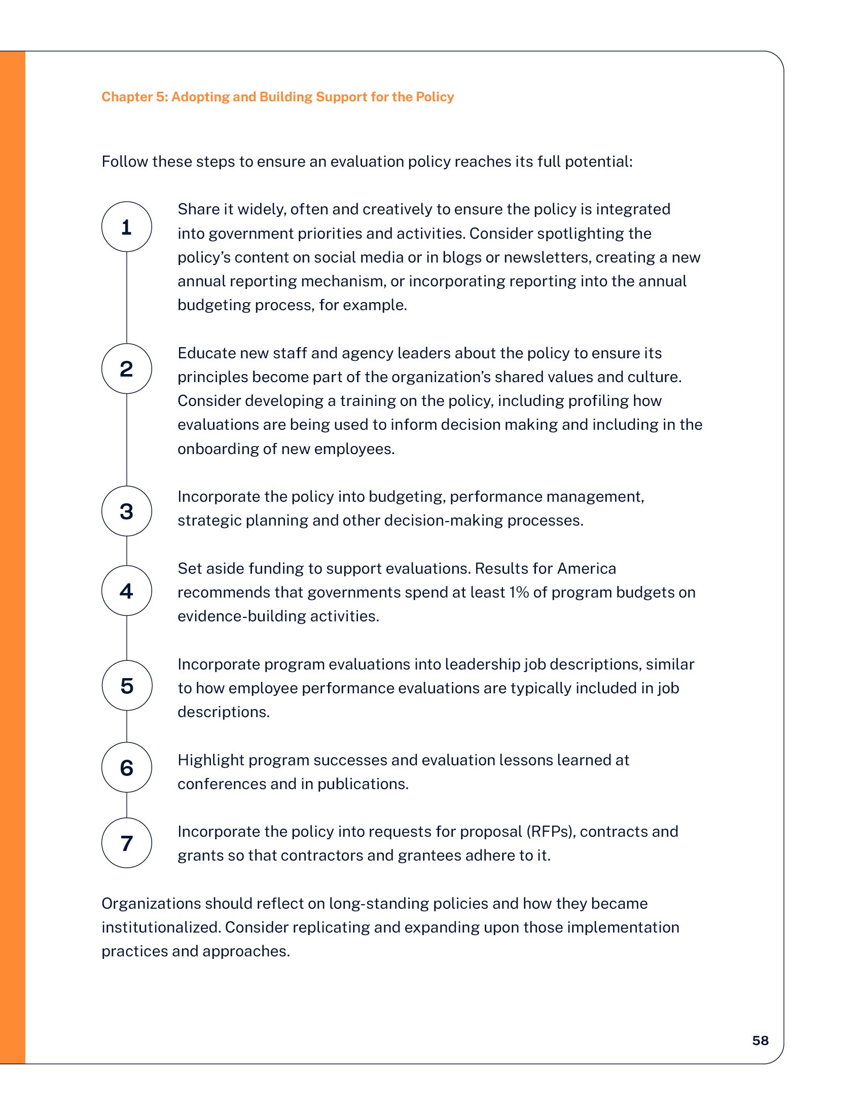
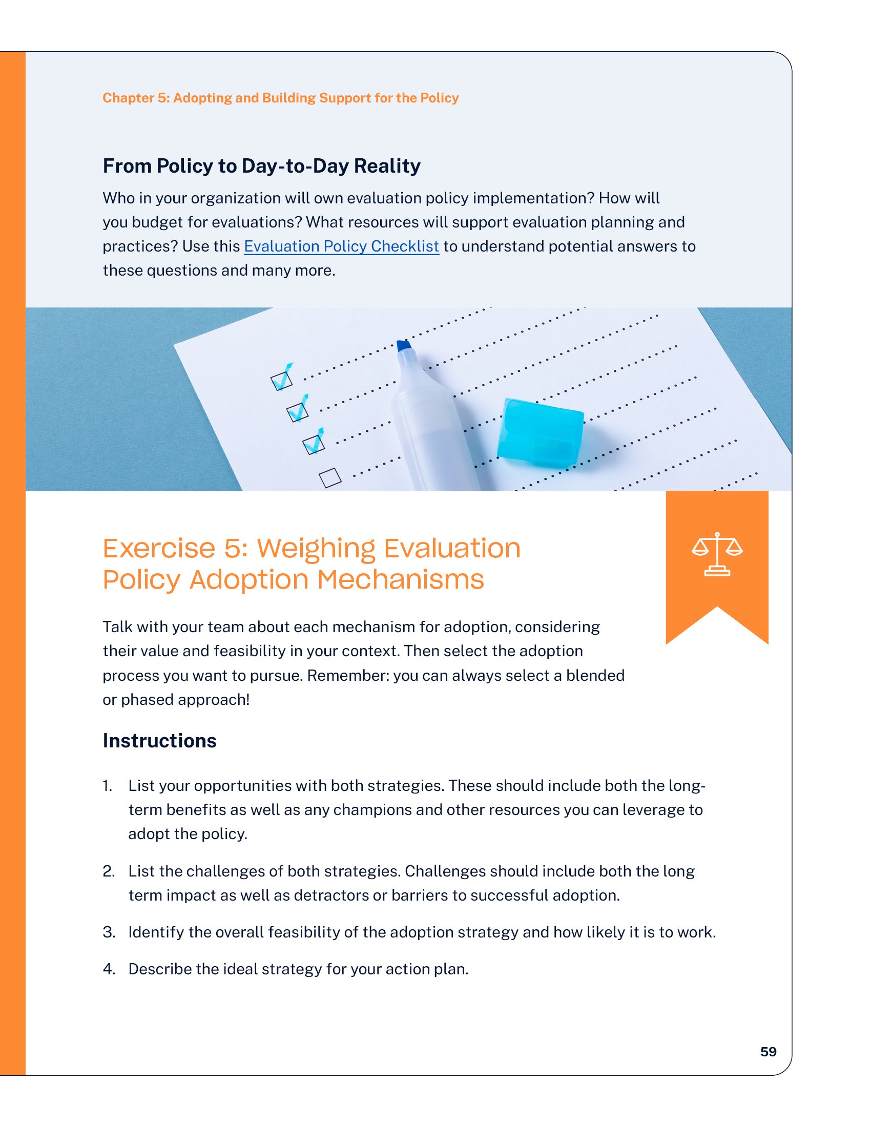
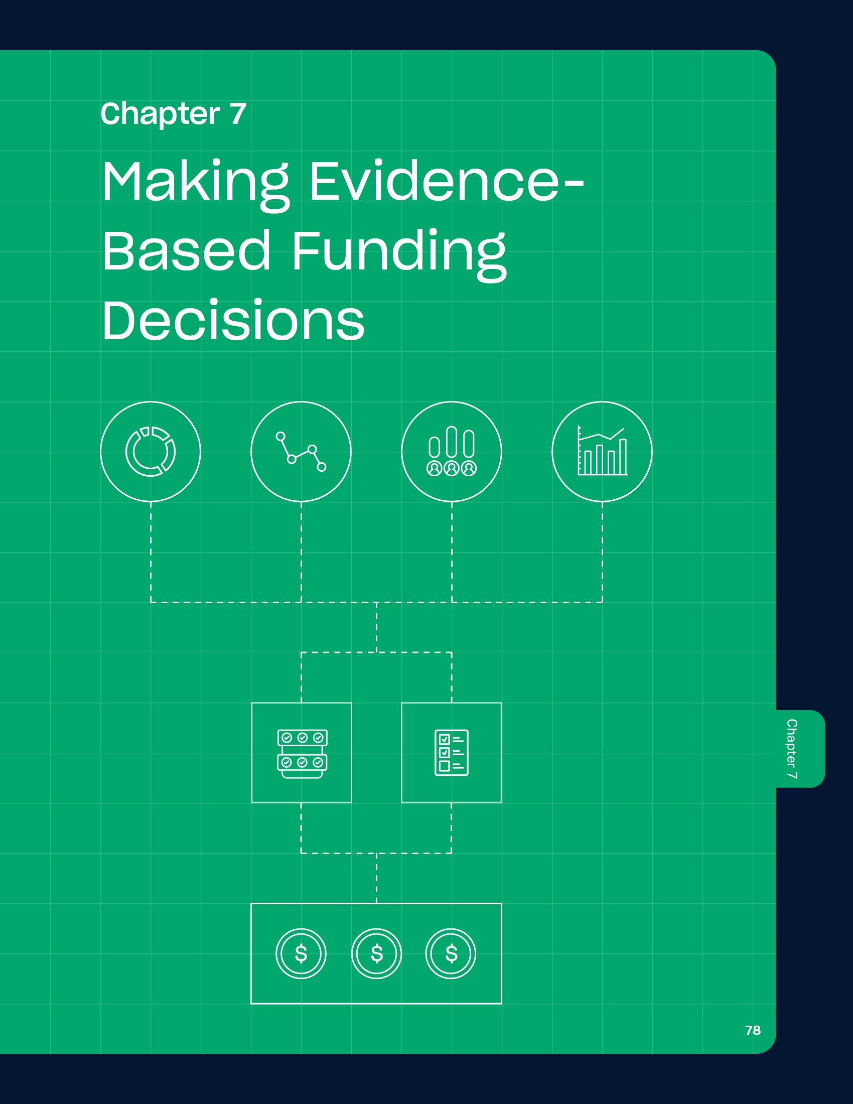
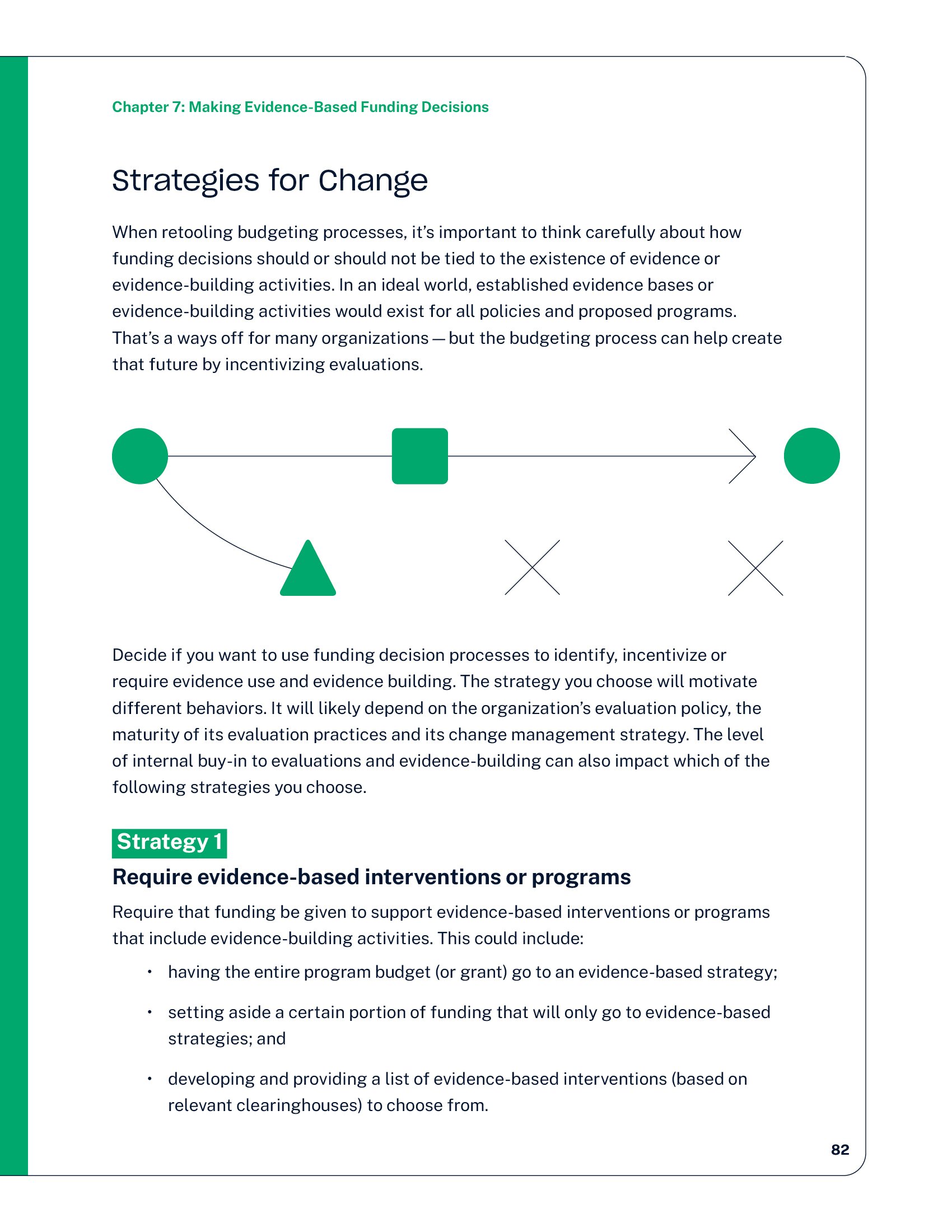
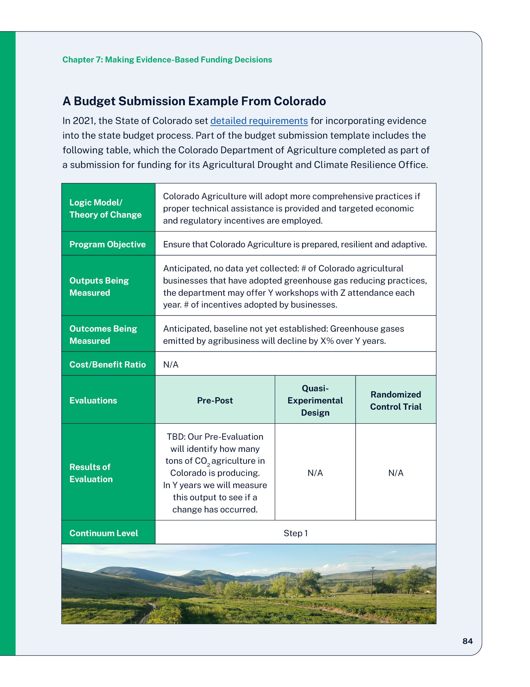
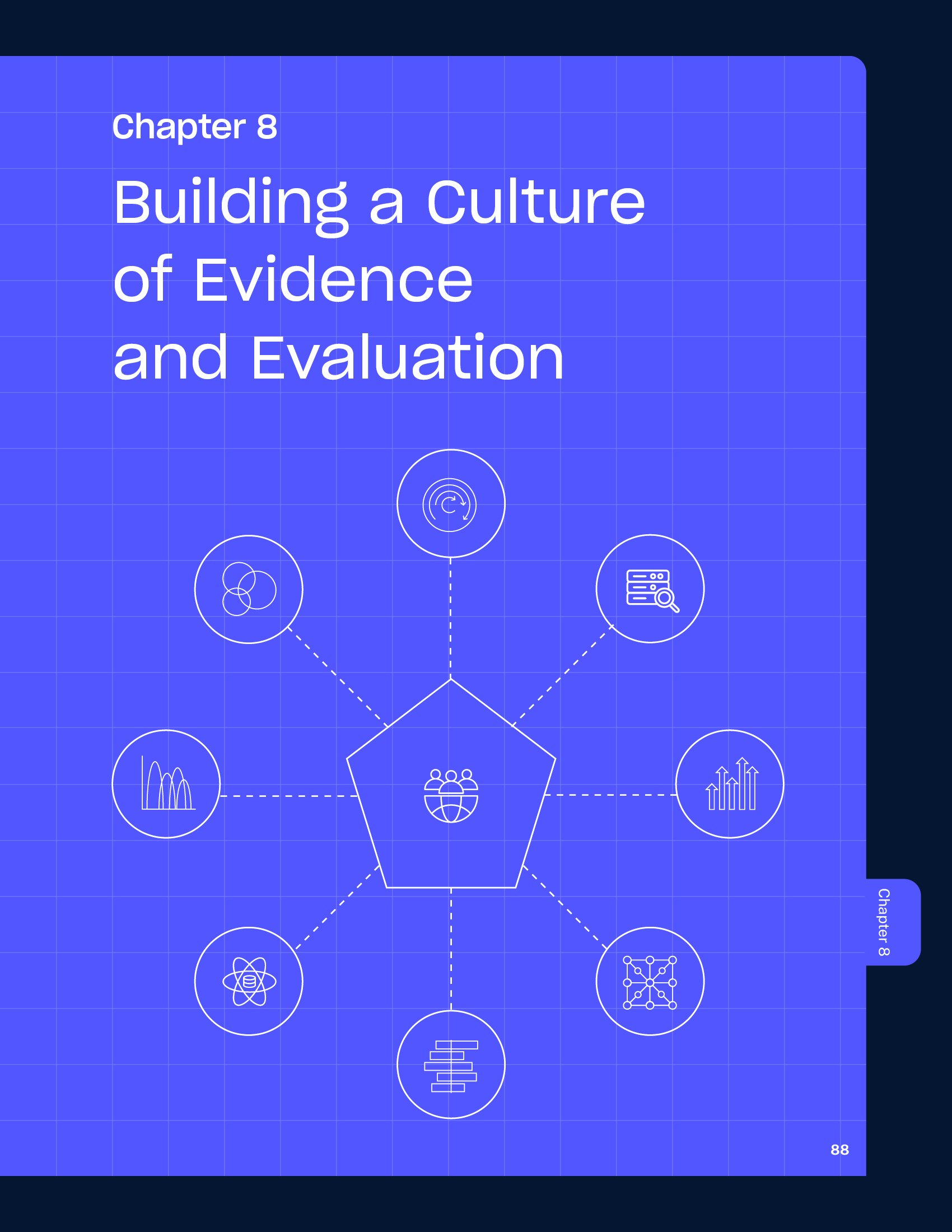
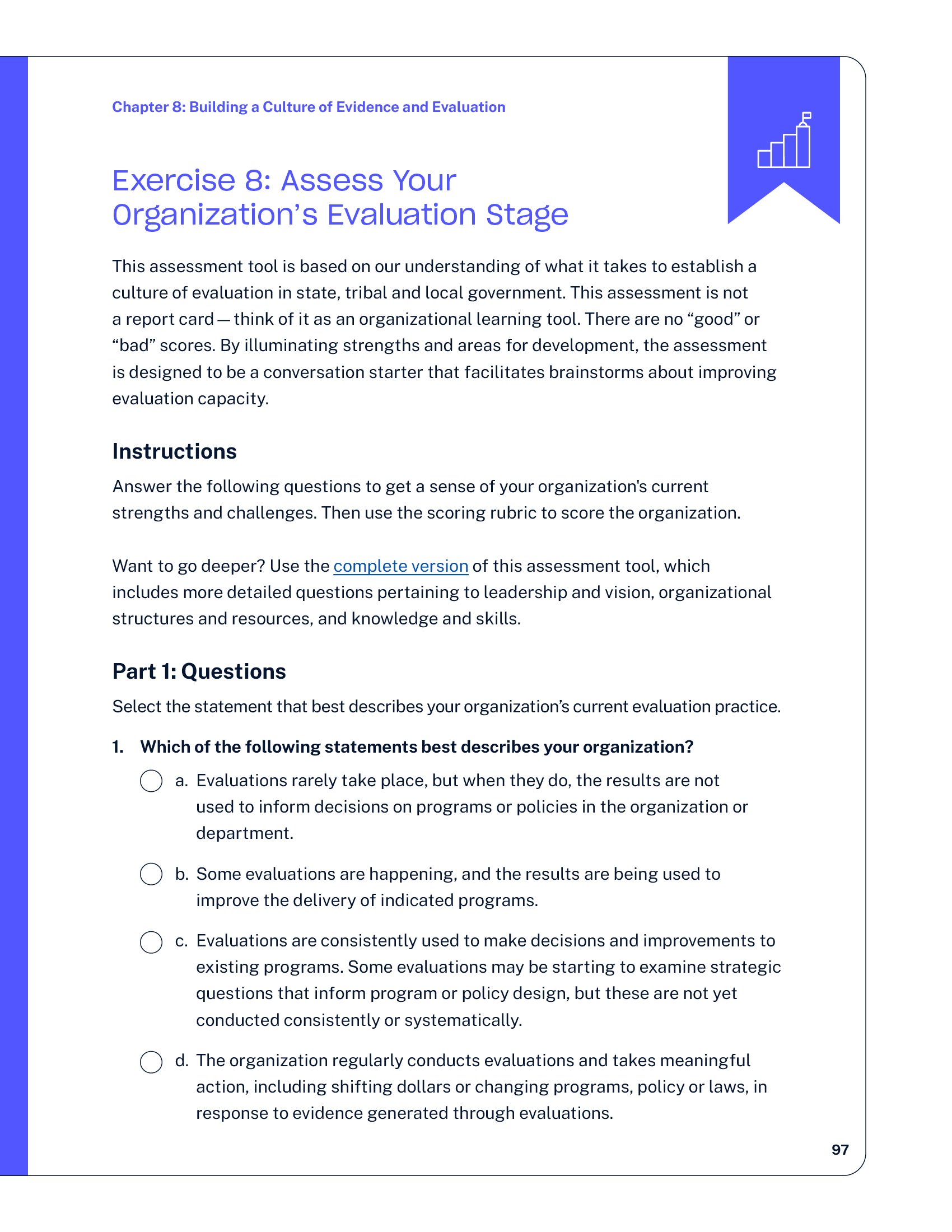
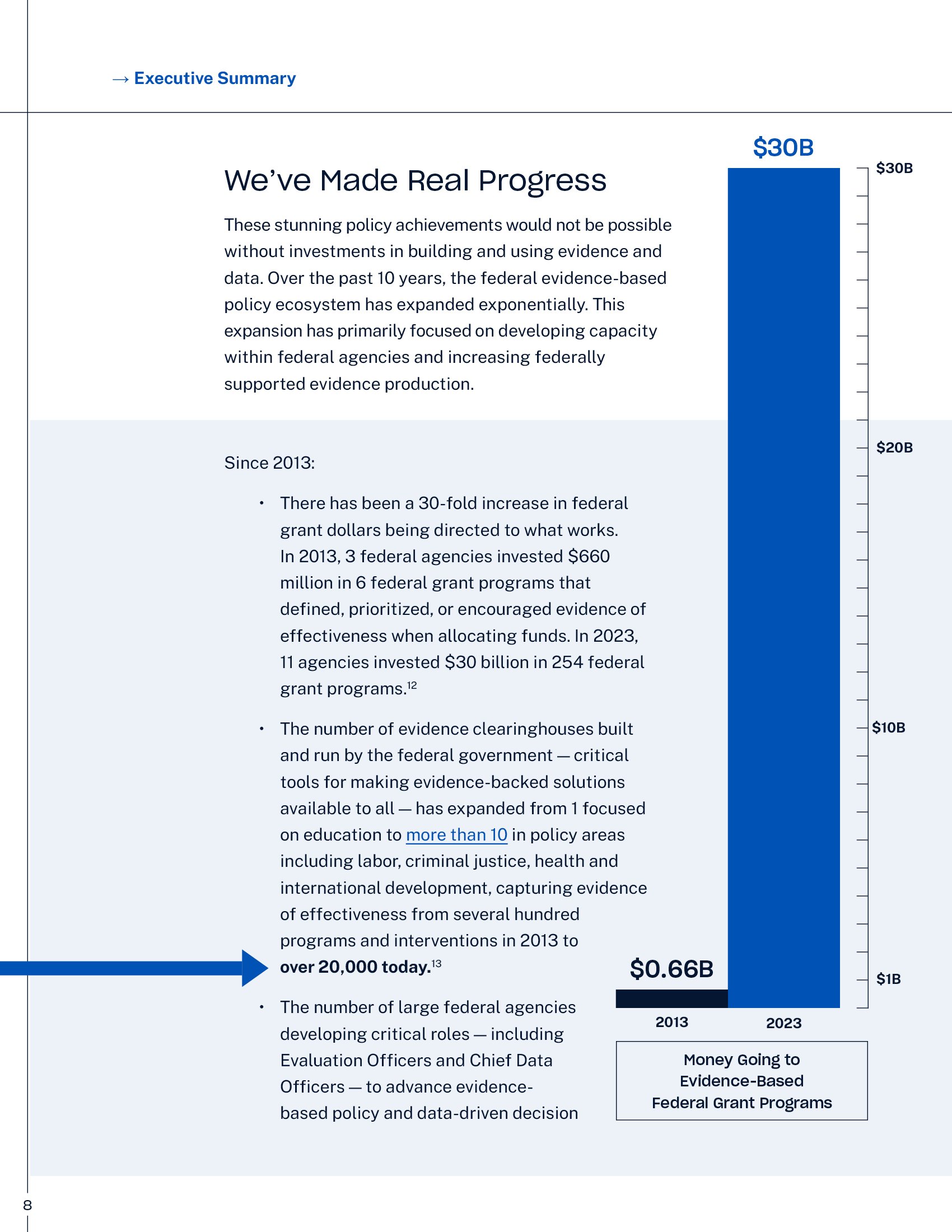
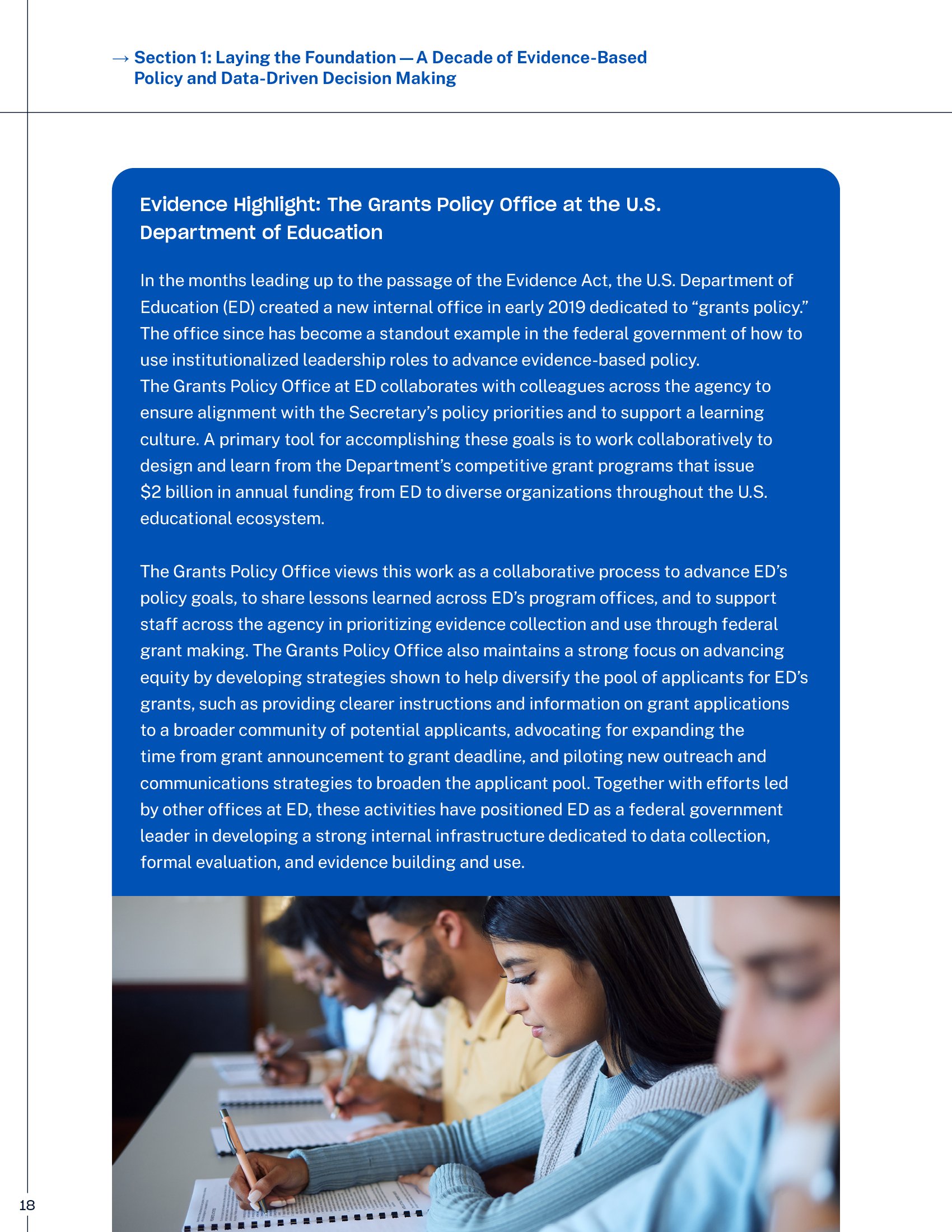
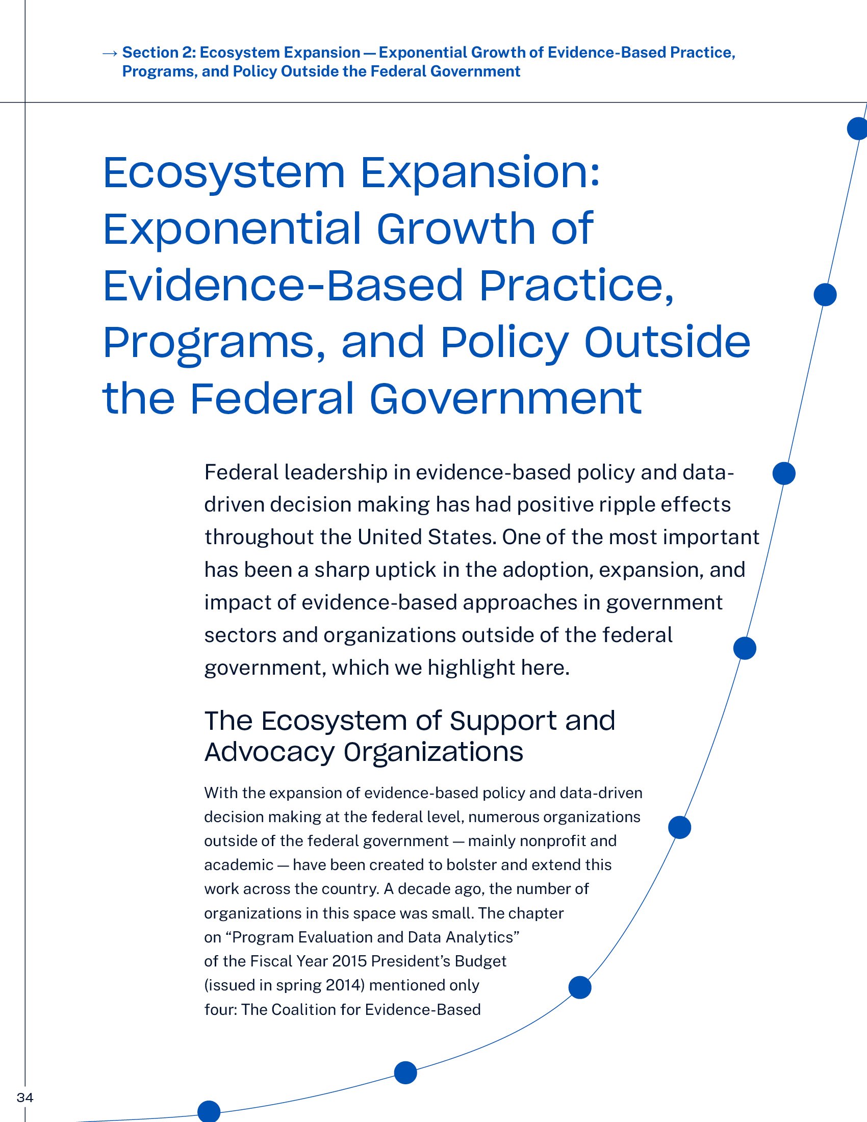
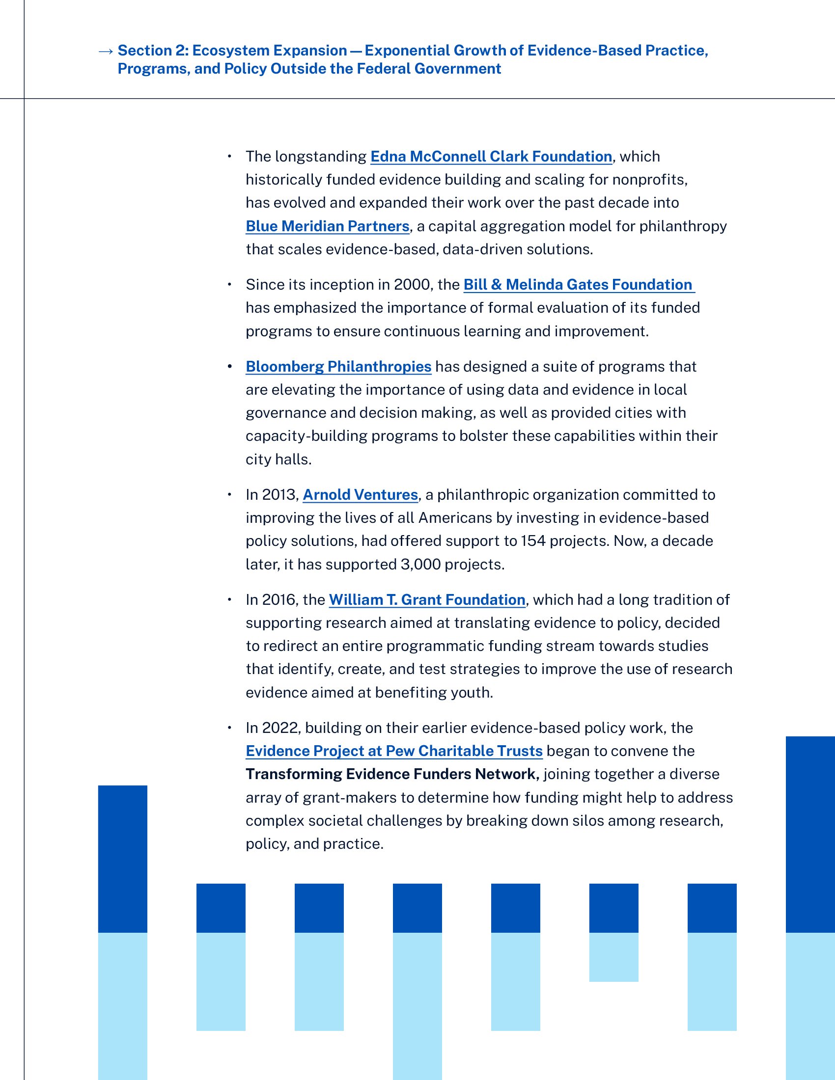
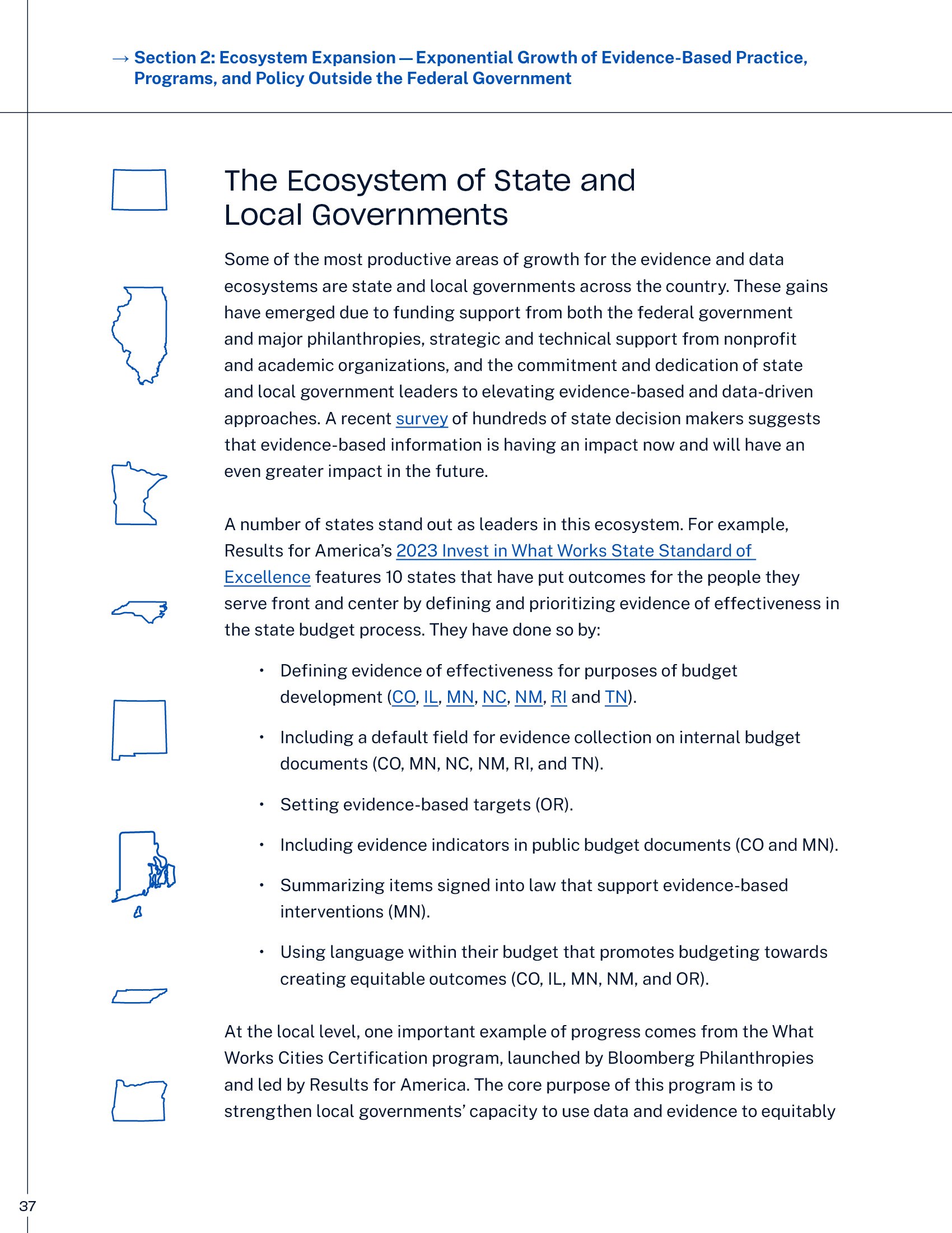
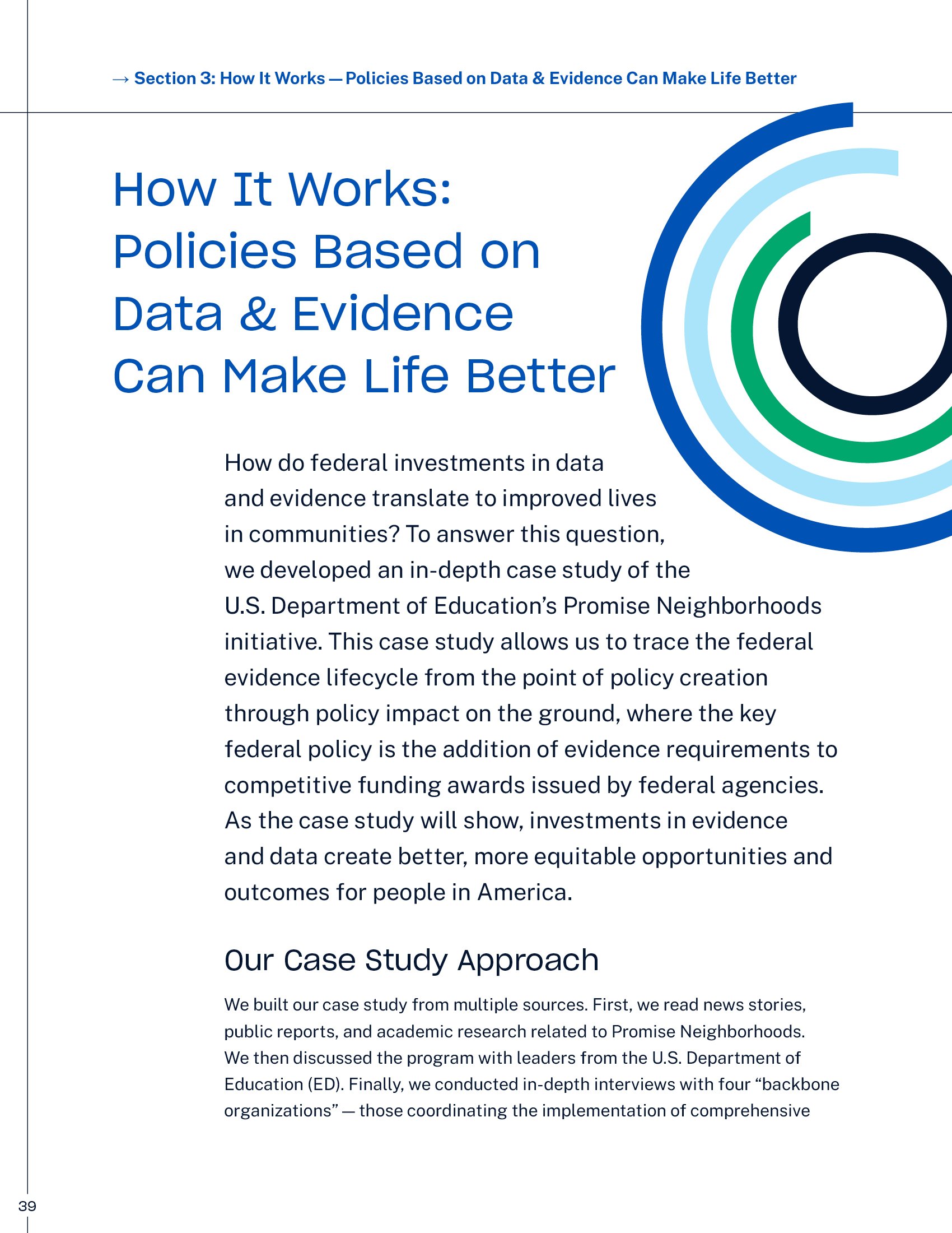
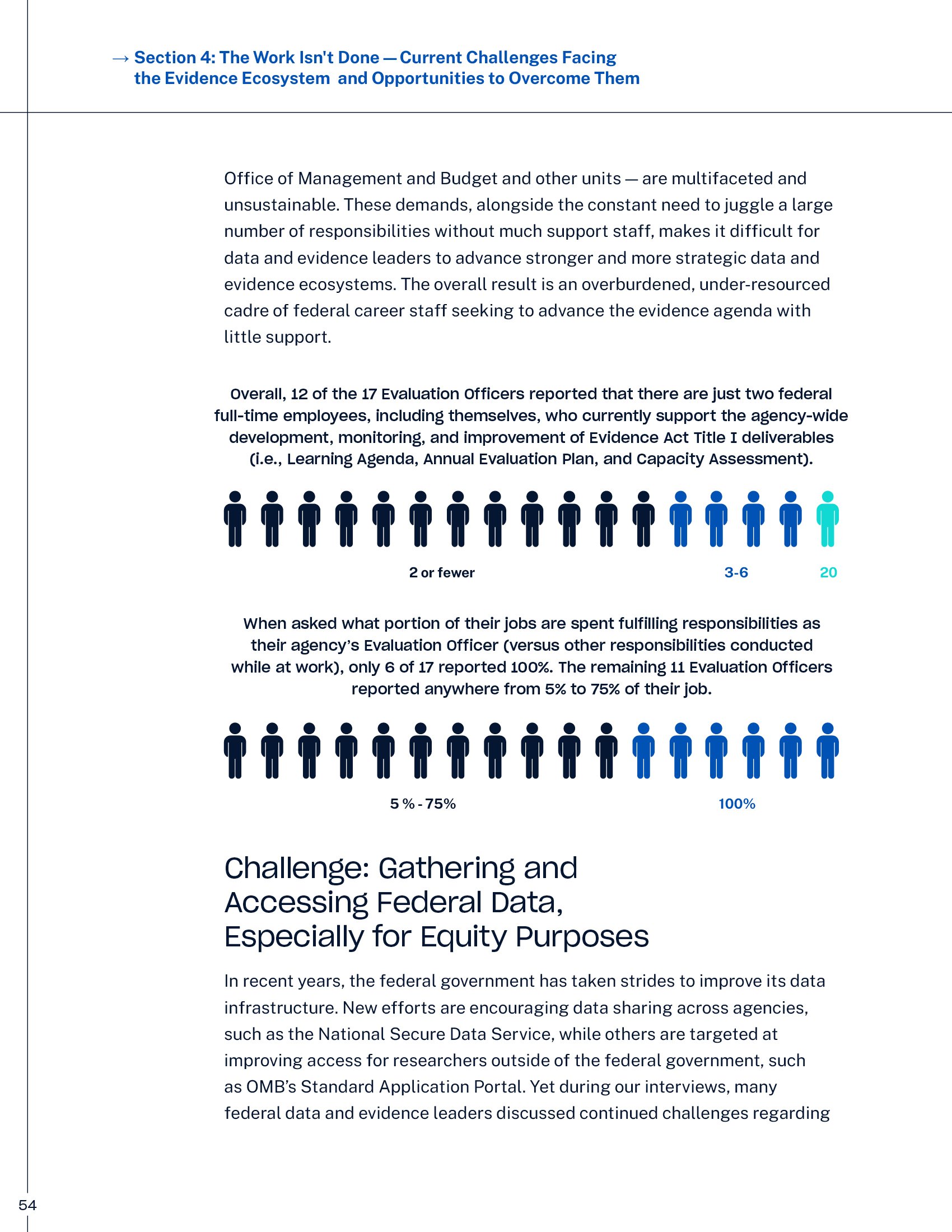
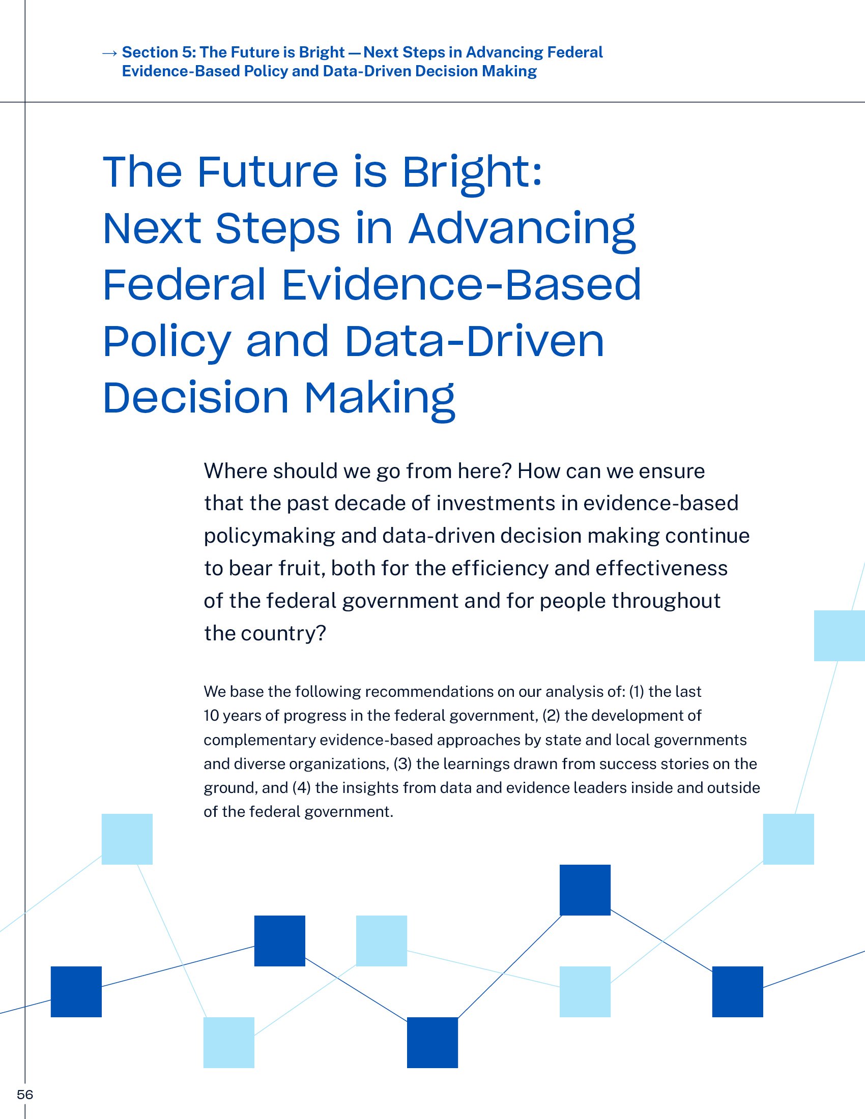
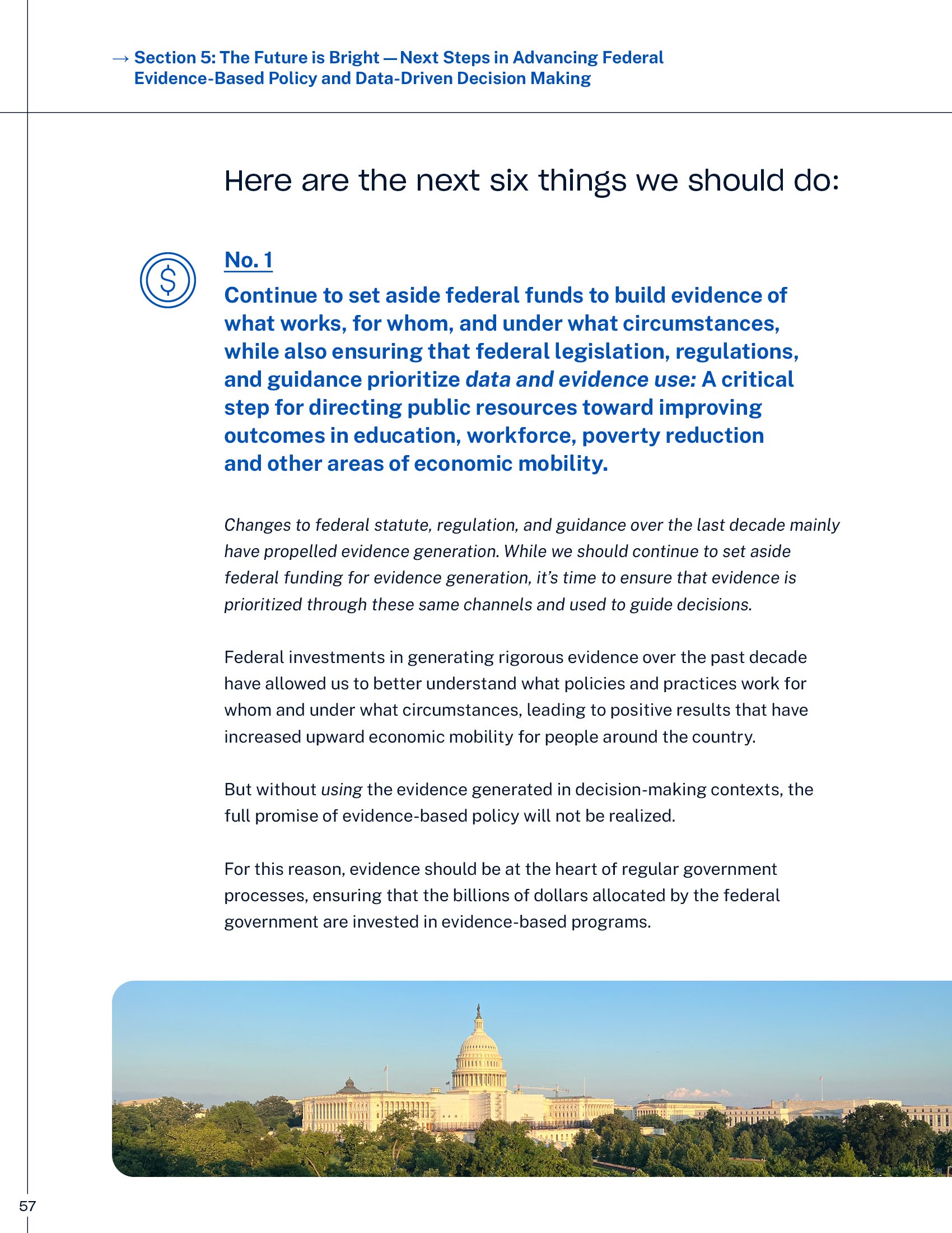
Results for America helps government leaders use evidence and data to create solutions that improve lives and increase economic mobility. The reports embrace their sophisticated color palette and graphic elements—duotone imagery, iconography, and abstract linework—while introducing playful touches that make complex content more approachable. For their policy guide, I adopted a workbook-inspired structure complete with tabbed sections, a graph paper motif, and schematic diagrams. This approach transforms dense policy information into an engaging, intuitive resource where color-coding and visual hierarchy guide readers naturally through the material.

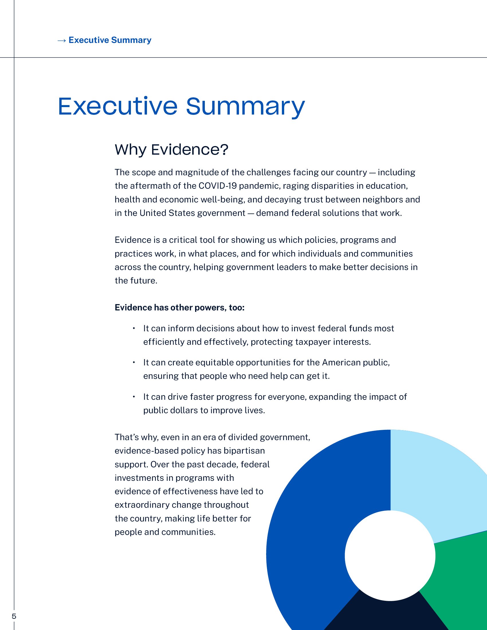
In their 10-year anniversary report, “The Power of Evidence to Drive America's Progress,” data visualizations transcend their functional role to become decorative elements, creating a fresh visual metaphor for the organization’s mission of using data to drive change.


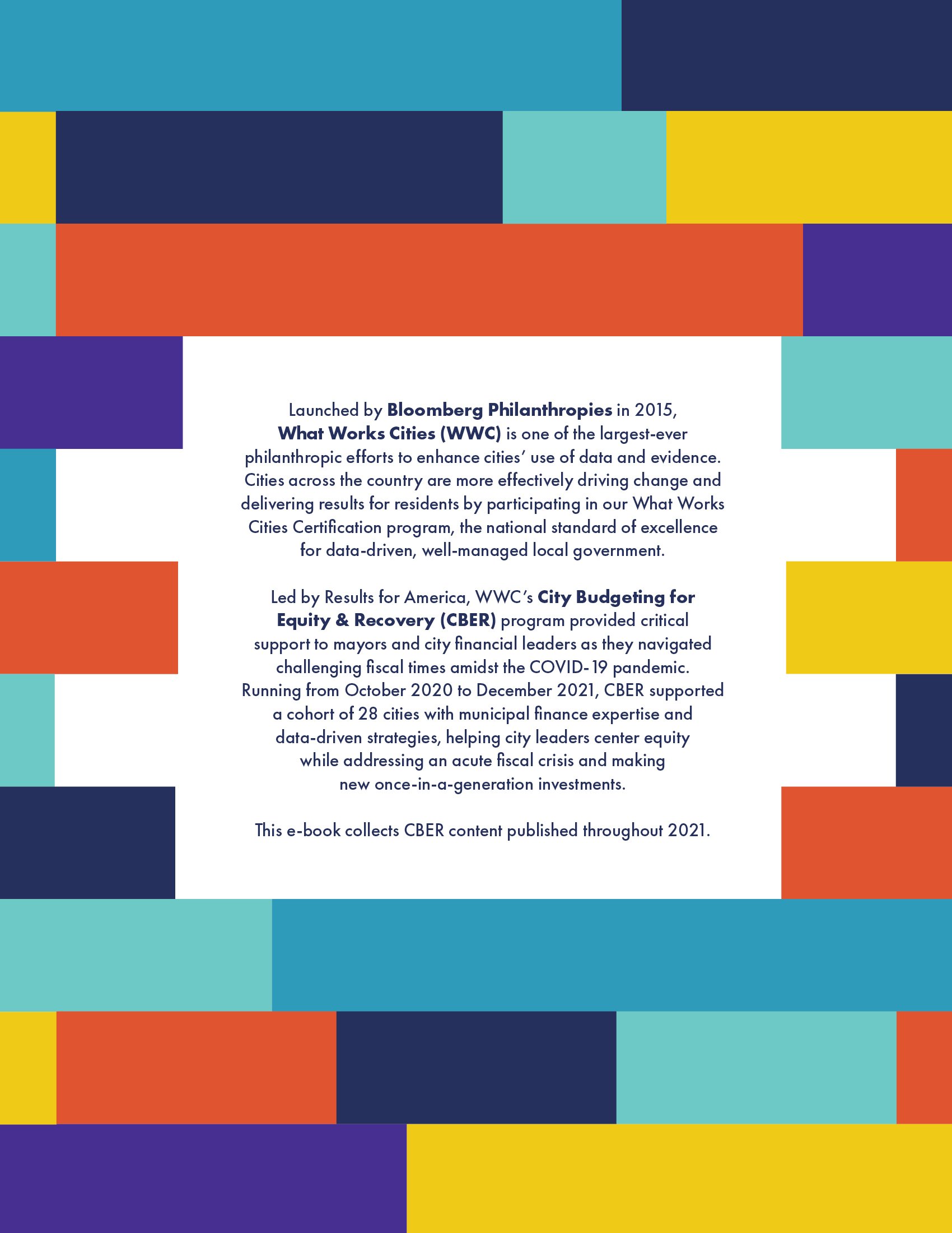
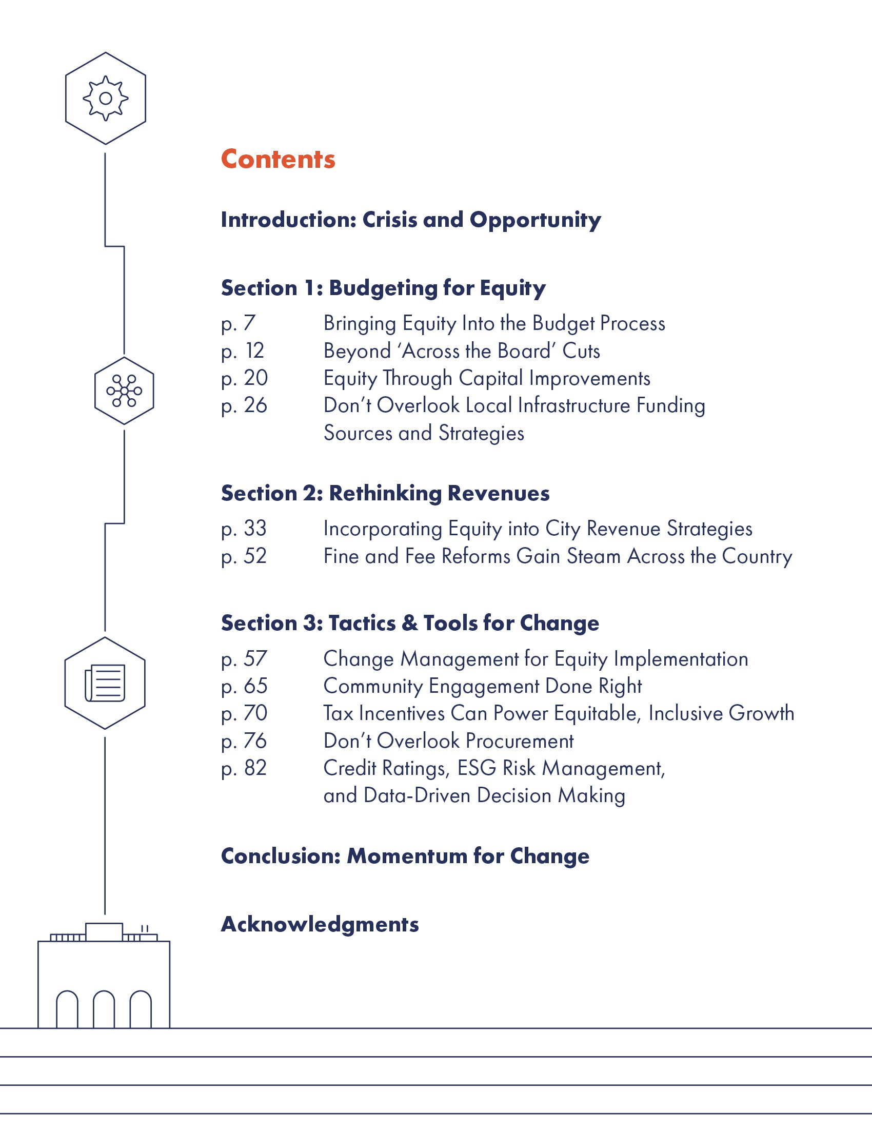
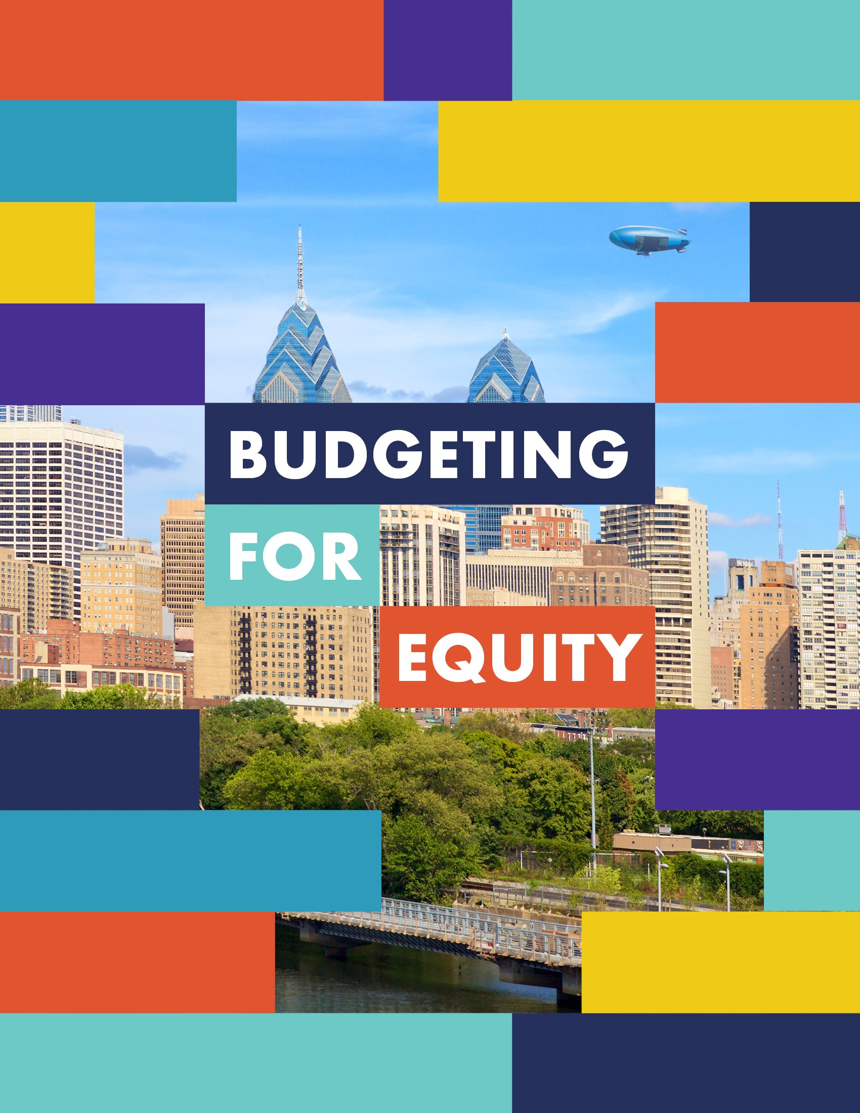
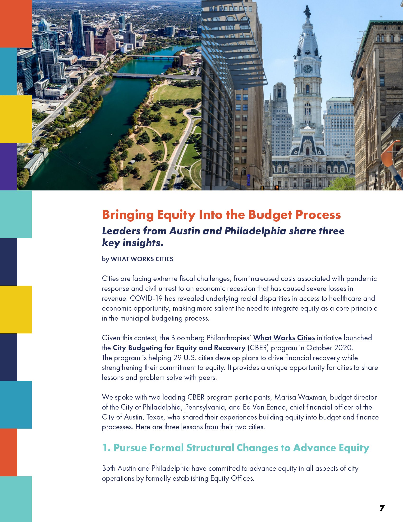
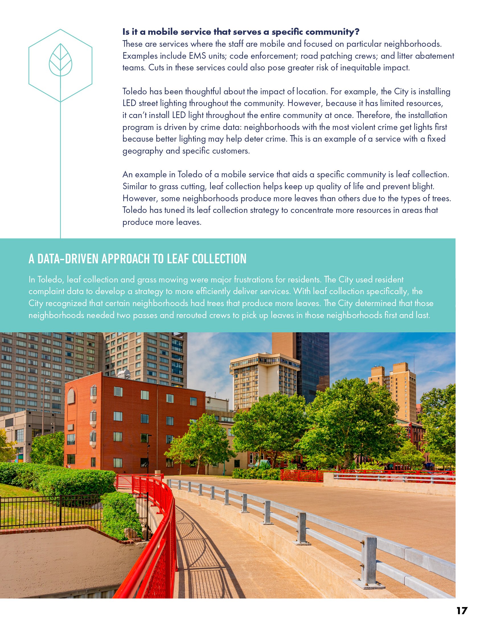
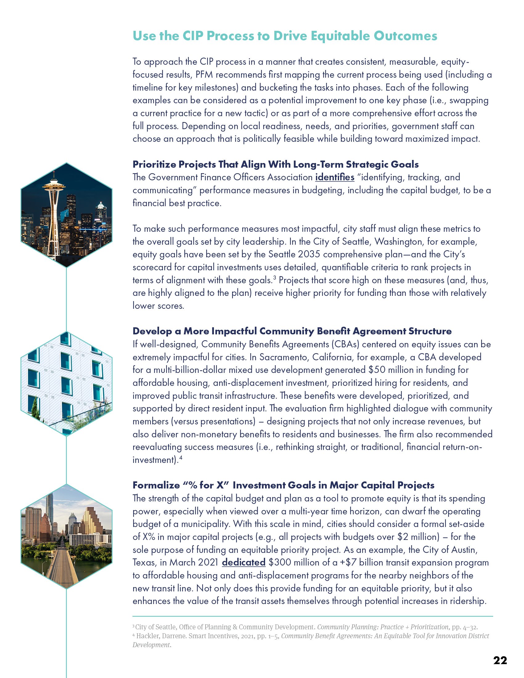
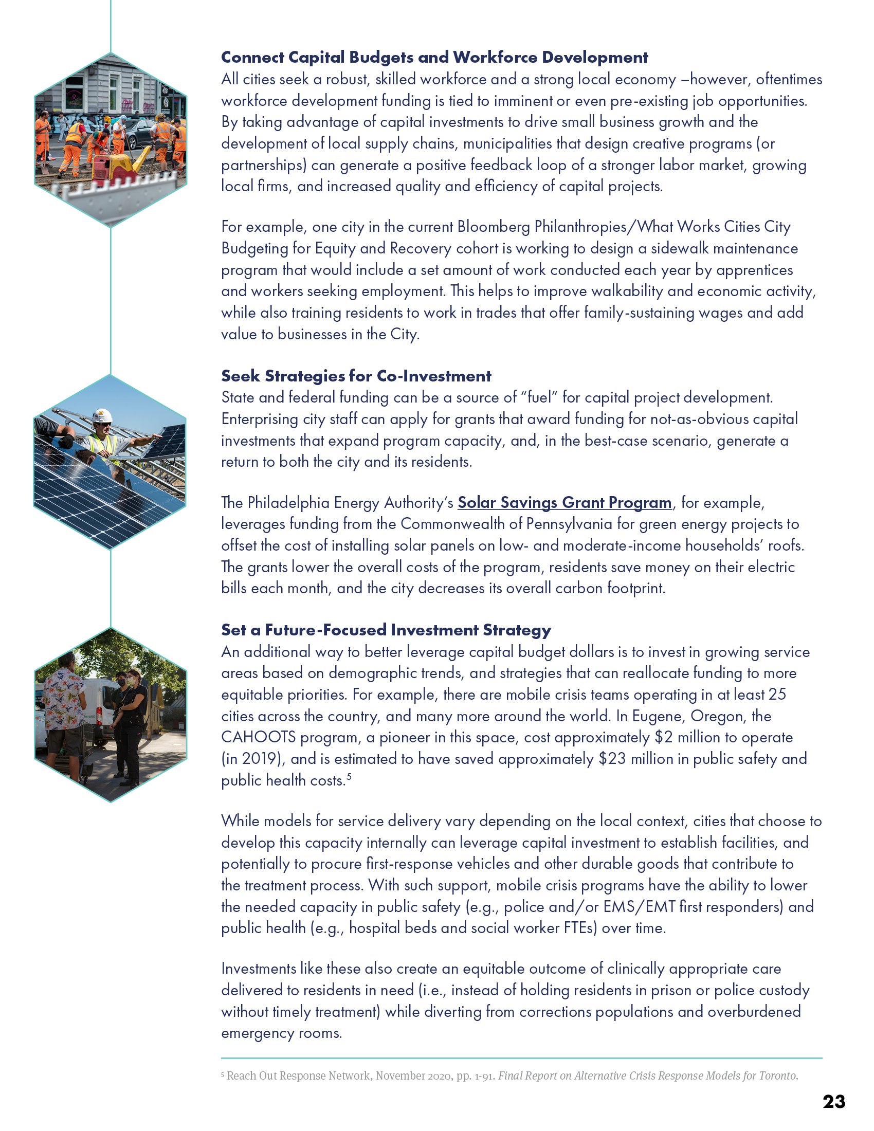
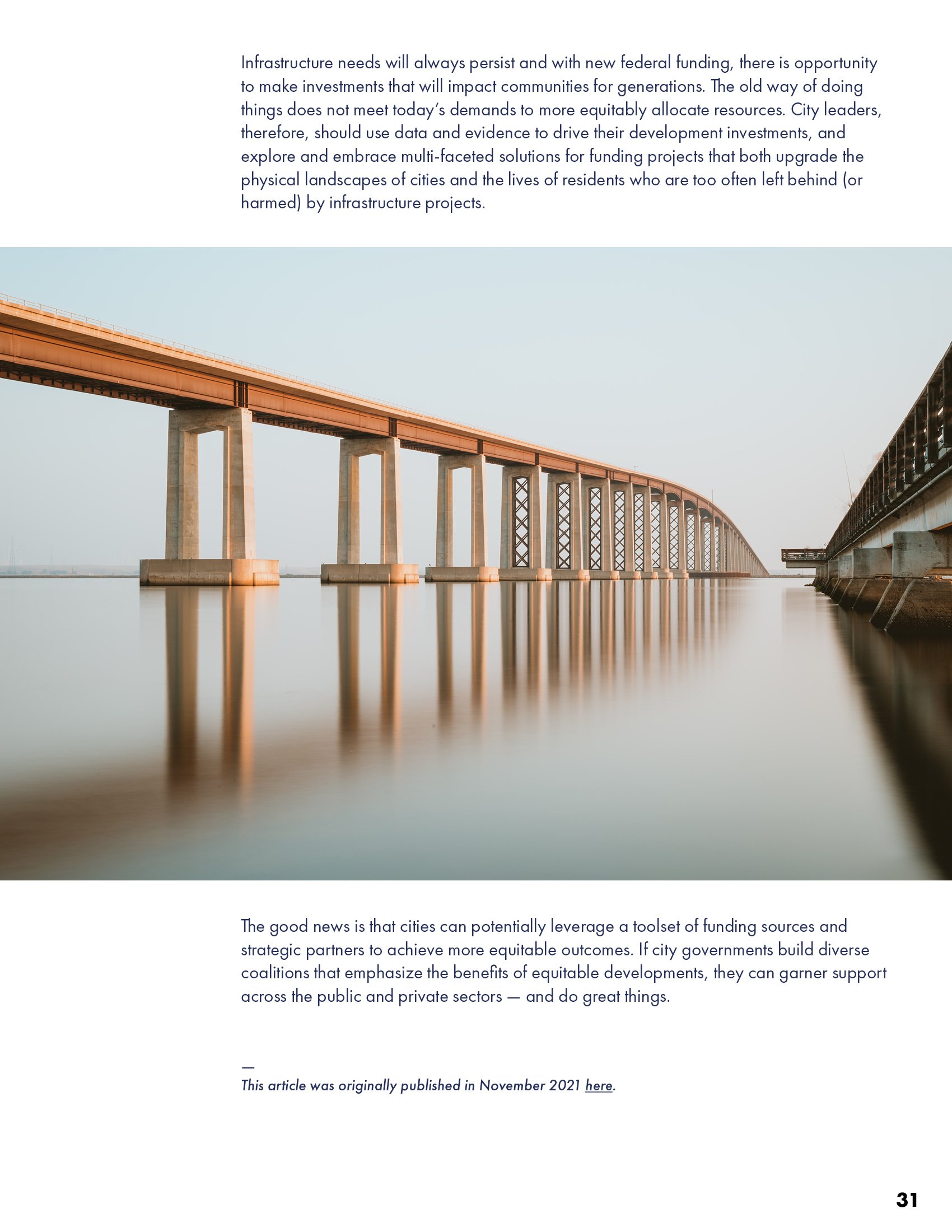
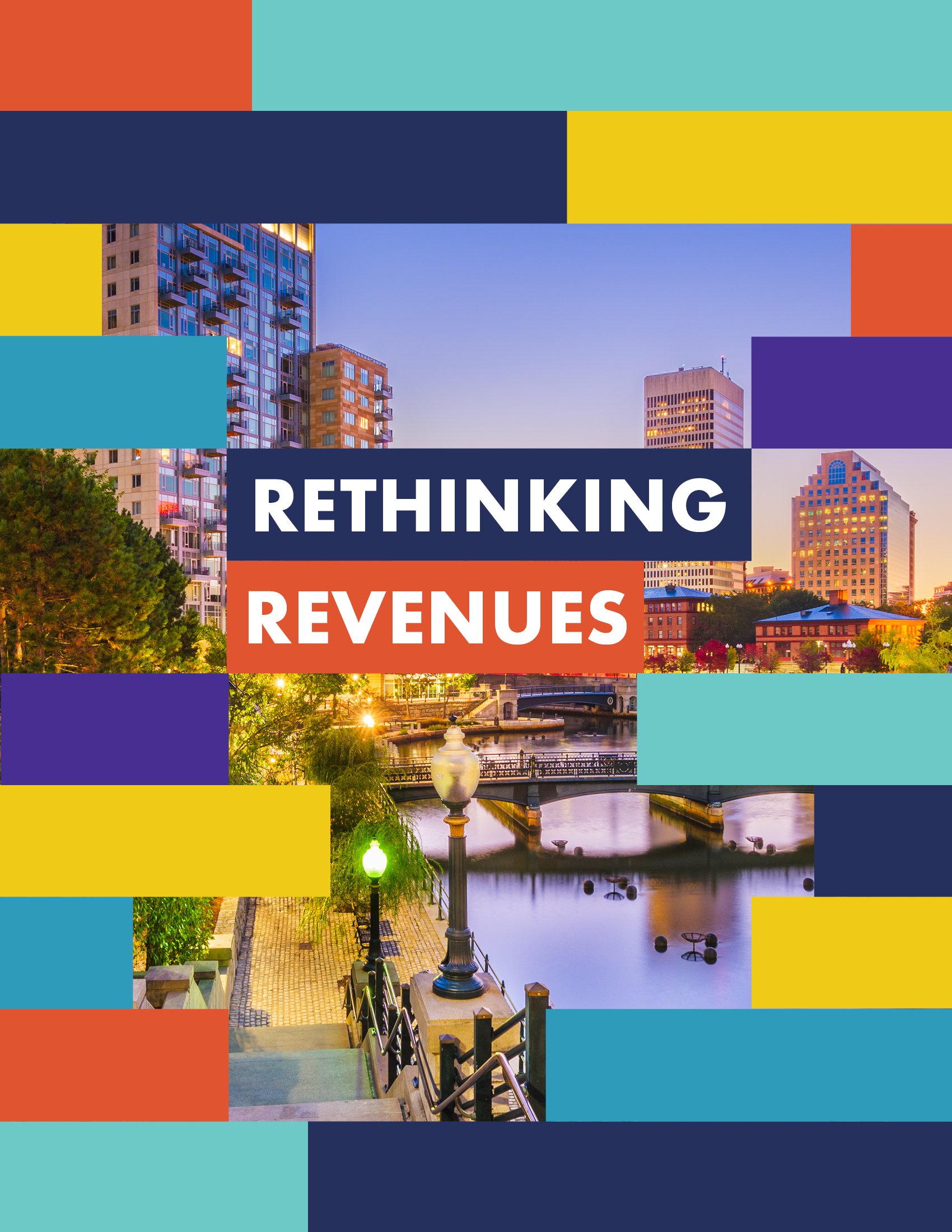
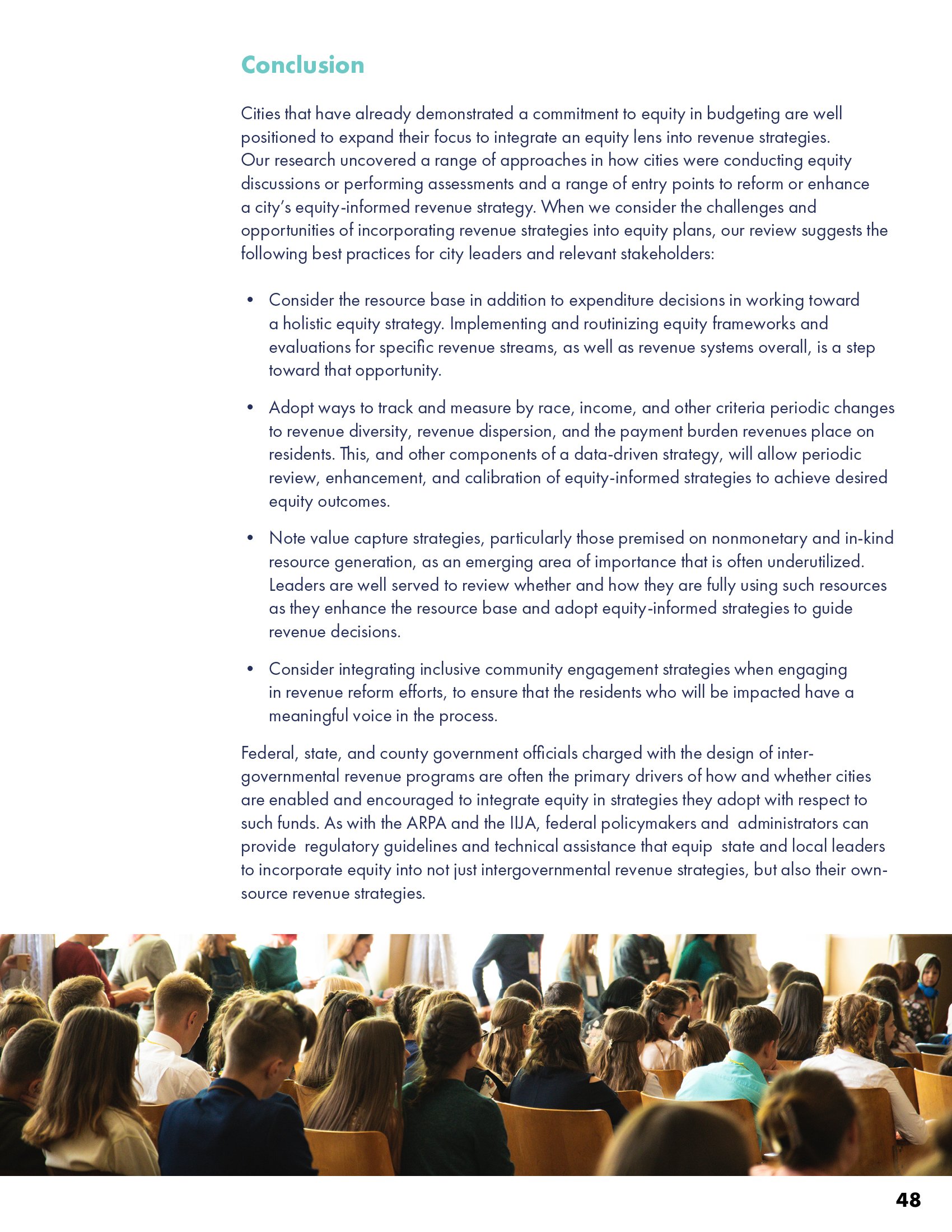
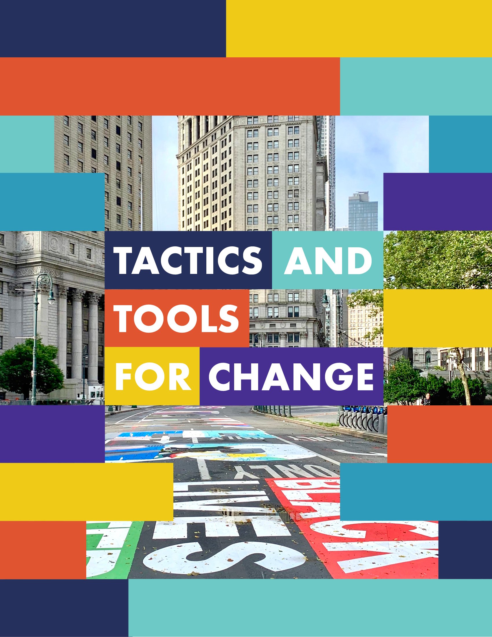
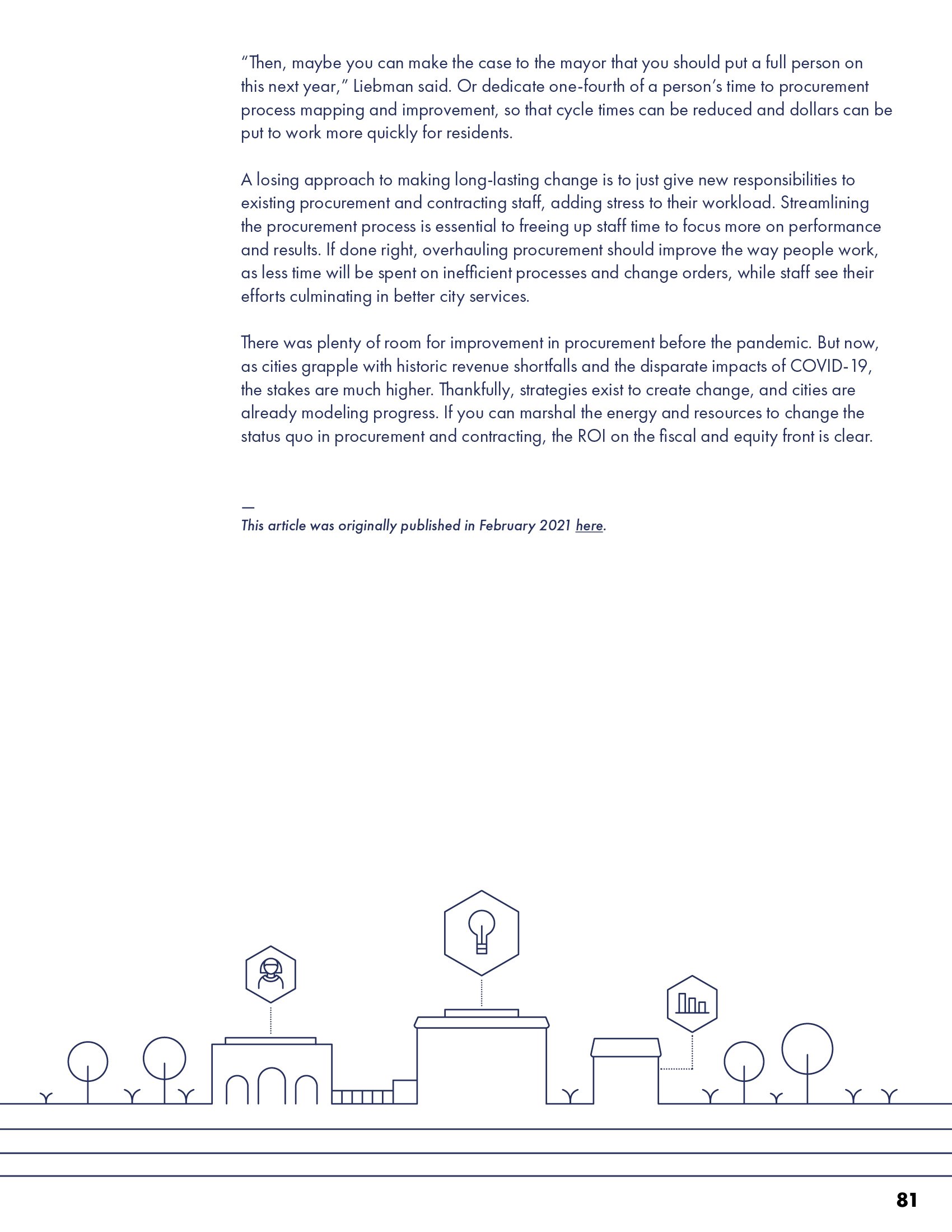
What Works Cities, an initiative of Bloomberg Philanthropies, brings Results for America’s data-driven approach to local government. Their City Budgeting for Equity & Recovery report uses a similar visual strategy—transforming data elements into design motifs—while establishing its own vibrant identity through bold urban photography and very bright colors. Stacked geometric shapes serve double duty as infrastructure metaphors and statistical visualizations, reflecting the program’s goal of building stronger communities through evidence-based solutions.


RiseUp Redwing connects youth and families to vital services in one Minnesota county, bringing partners together to help young people unleash their potential. Their impact report balances vibrant brand colors with thoughtfully treated photography—alternating full-color images with duotone overlays to create visual rhythm and warmth. Strategic use of callouts, icons, and infographics brings their community impact story to life in an inviting, dynamic way.


